|
Jeanette and Yasmin did some posters to be used as marketing for the exhibition. We then came with the idea to animate them and use them for the social media as to attract more people and perhaps even possible employers. Since I had previous experience with animation, I took the initiative to take on this task. Jeanette and Yasmin took care of slicing the posters into layers so I can animate them.
It took me some time to plan out which is the best way to animate them and make them look good. Manuel told me to use a 2.5D effect on them and I instantly loved the idea. I had a clearer idea on what I had to do so I started working on them.
0 Comments
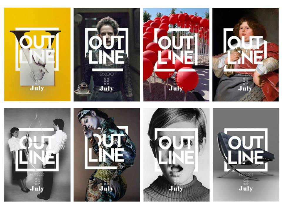
We all started working on our specific tasks and getting information and doing the necessary research. We decided to talk about how to implement the logo and we all agreed to use the Out Line name for our concept. Logo: 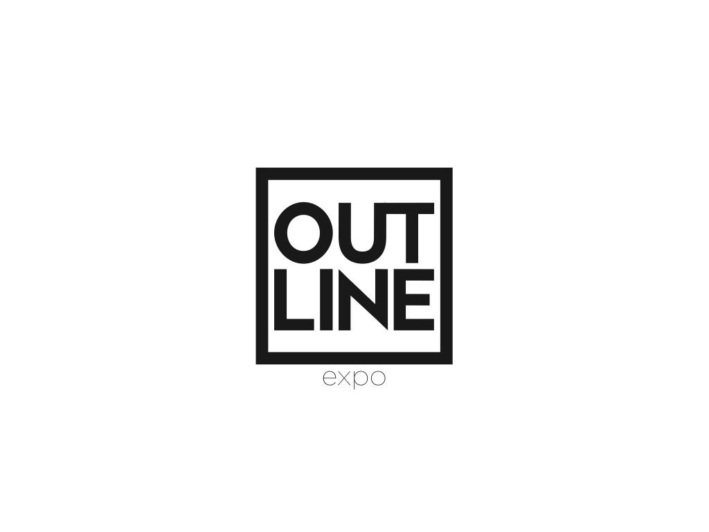 We wanted that the exhibition be more like an expo than a usual exhibition where the students can show all their work and unite to present professional work and to show what we can do.
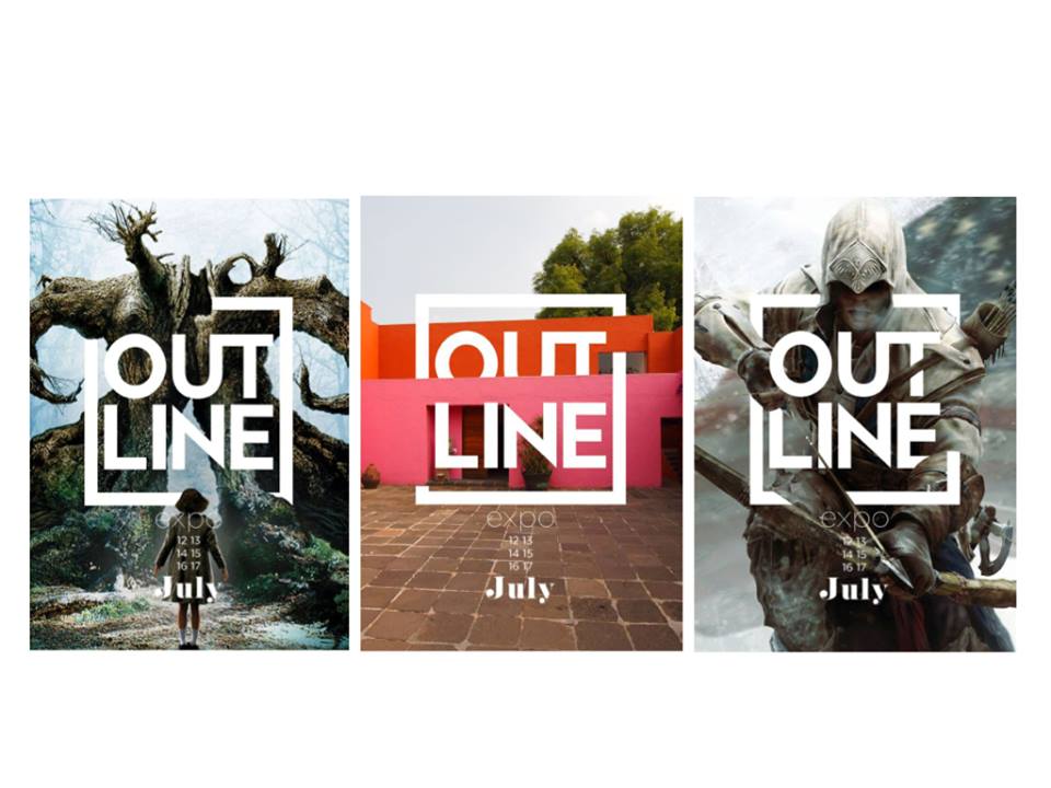
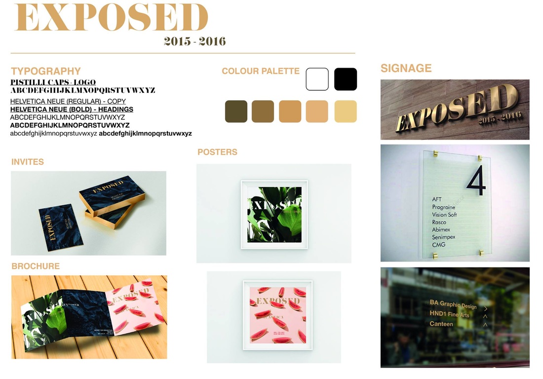
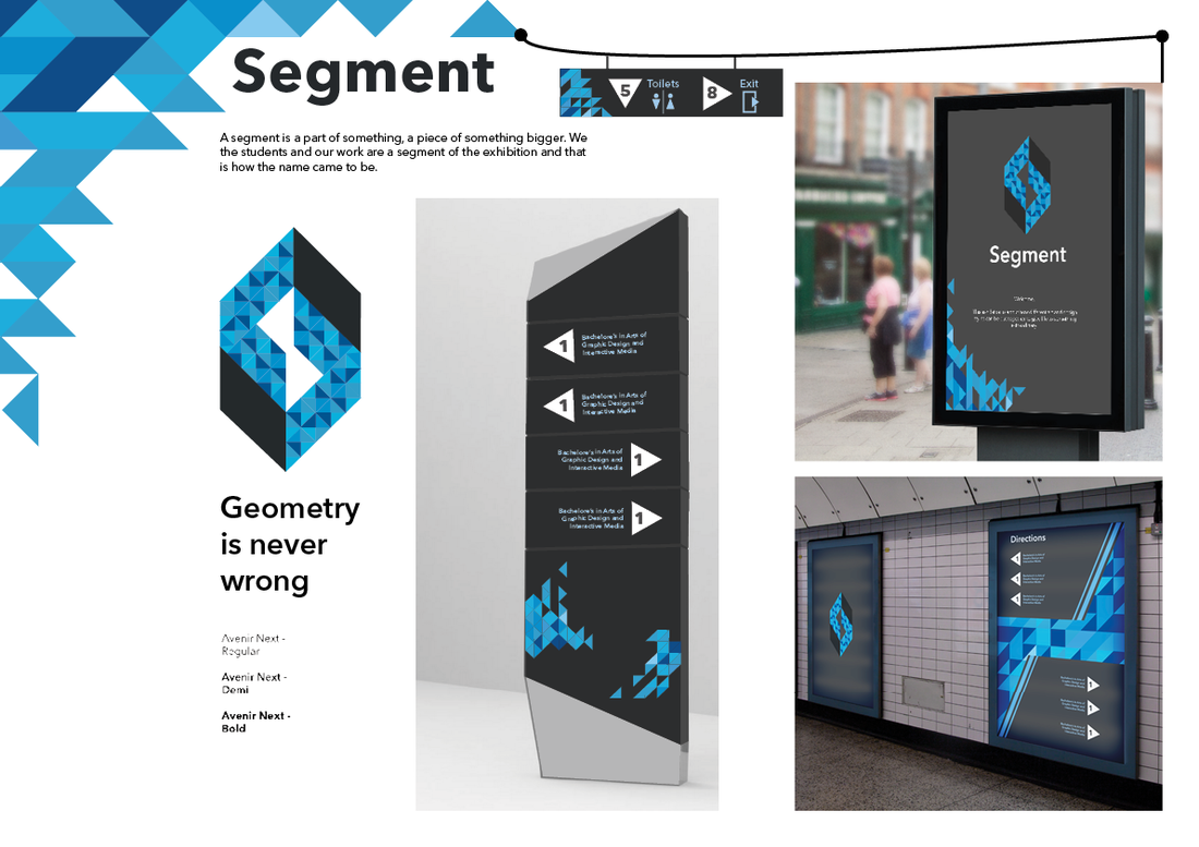
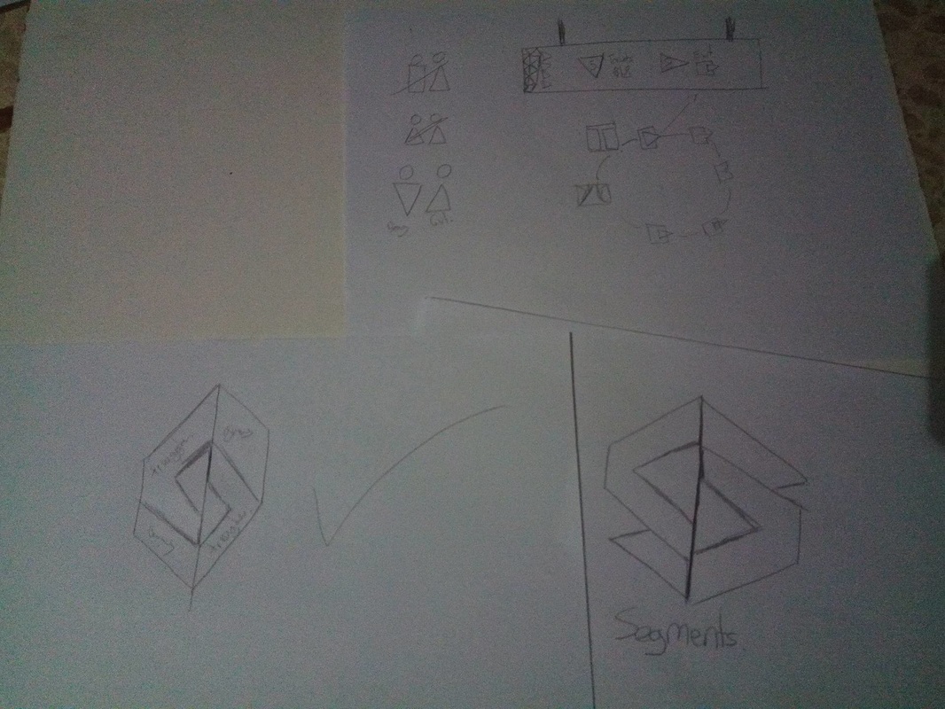
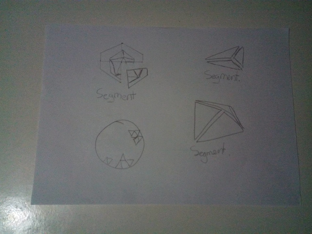
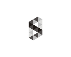
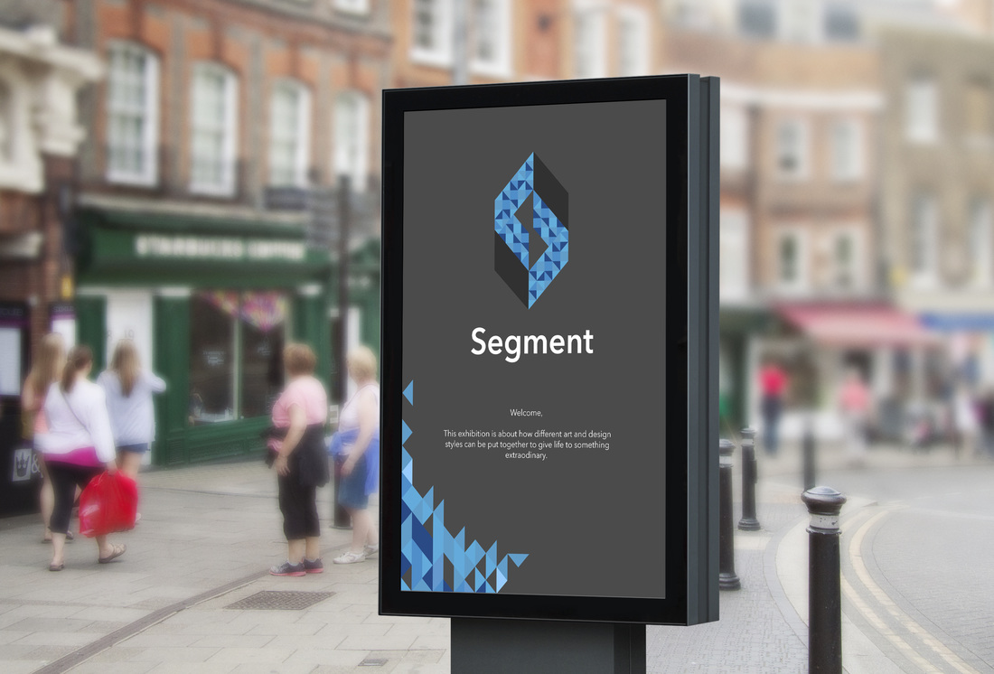
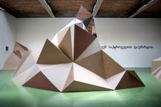
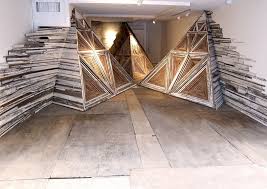
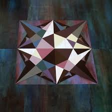
We decided to distribute the school in a different way. By grouping up graphic designers from all the classes and courses into one group and so on the other courses. We wanted to group up the students according to their profession and not by course or their level of education. These are 3 of the chosen concepts and they will be used together taking some features of each. We split up into groups and started to come up with ideas. My group consists of Manuel, Daniel, Myself, Jeanette and Yasmin. We decided who is going to do what and started working on the idea. Manuel will be doing the posters and branding. Daniel will be taking care of the invites and print material. Jeanette will be preparing the posters for animation and Yasmin will be doing the way finding. I will be taking care of animation of the posters to make like small gifs and also will be doing a prototype of a facial projection animation. I feel confident working with the rest of my group as they respect each other's ideas and listen to each other which is a very good and important thing when working in groups. Other Concepts chosen I finished up the concept boards and was satisfied with the outcome. I wish I could have put more information and to describe them more but there wasn't much space to do so. I presented the concepts in front of the lecturer and he liked the Segment one more than the others. Sketches For this concept I chose to use geometry shaped items. The reason for this is because I think that geometry represents us as students which are segments of a bigger picture. The exhibition and the school are the object and we are the segments that make it whole. Final Logo  Aims of SegmentThe Aim of this concept is to use geometry to signify us the students and everyone who is present in the exhibition. Main Aims:
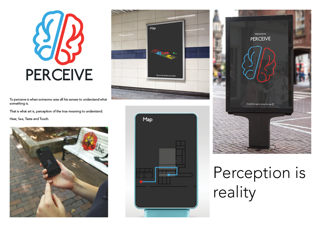
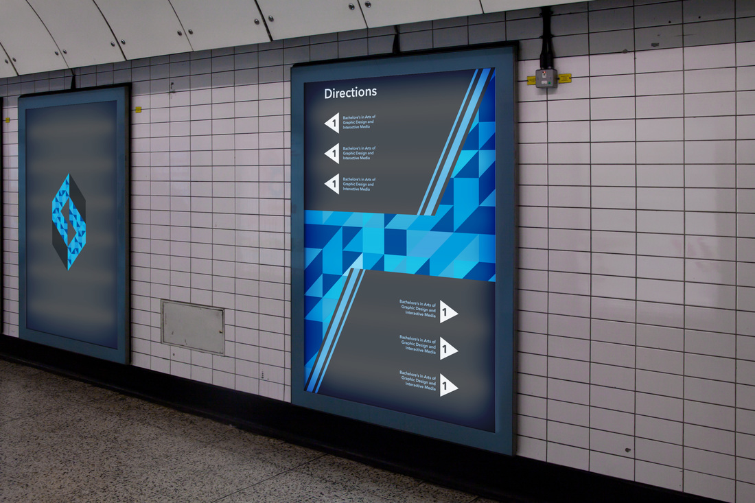
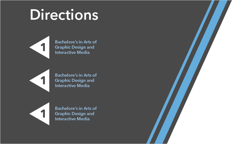
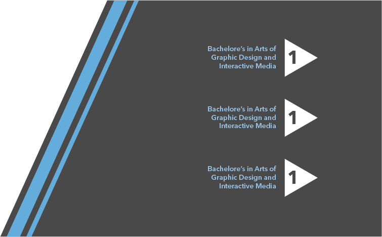
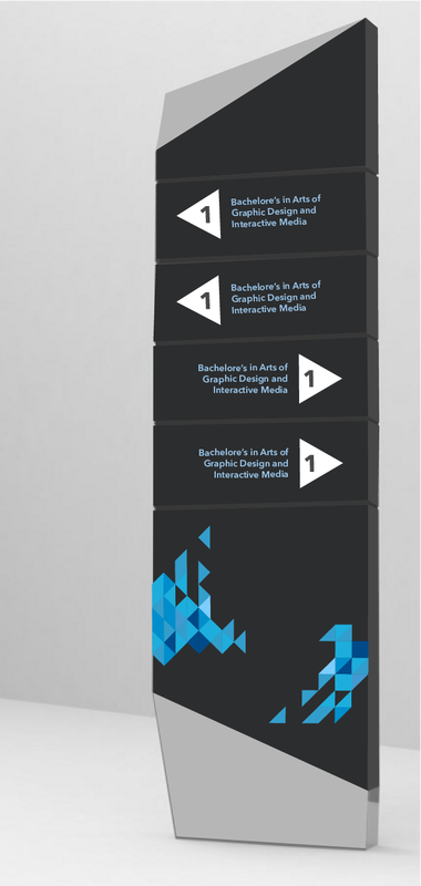
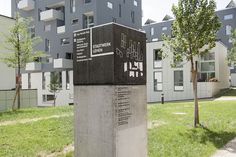
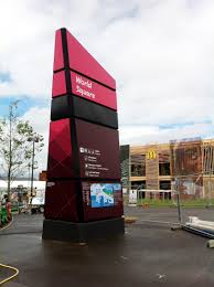
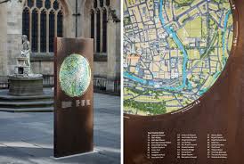
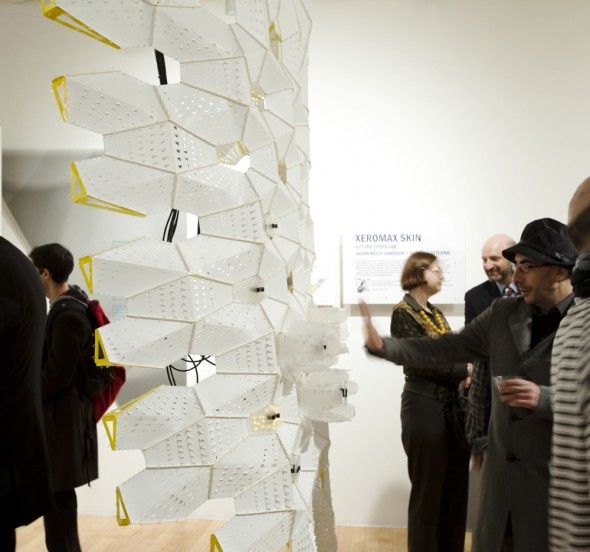
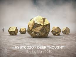
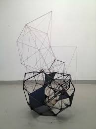
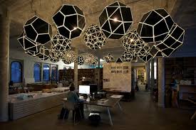
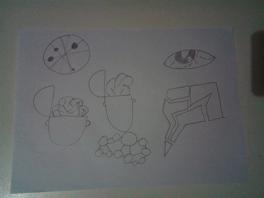
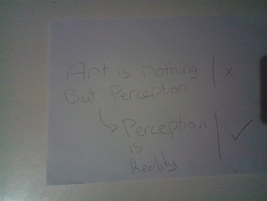
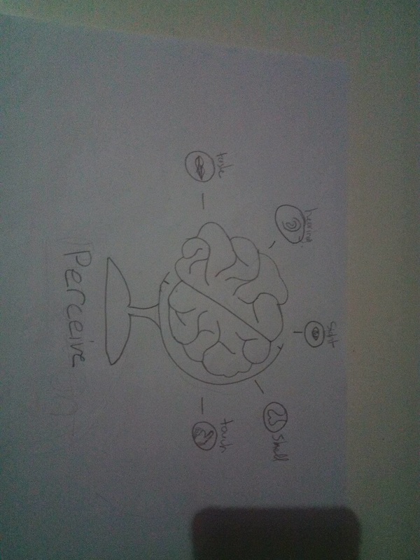
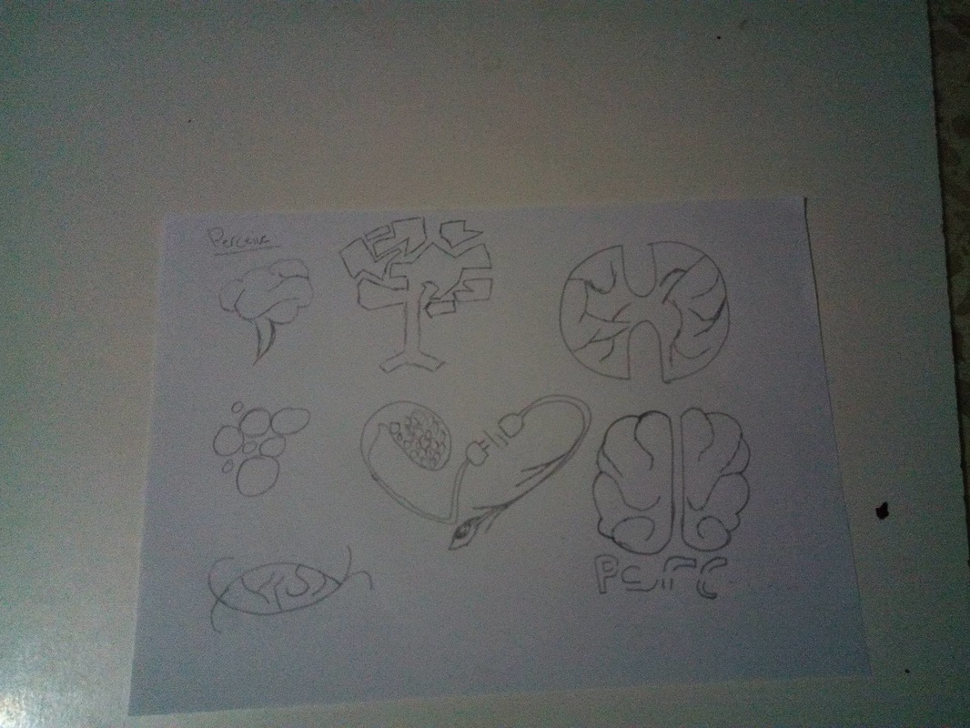
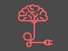
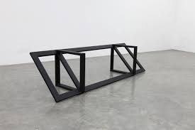
Inspirations Segment WayfindingSegment will be based on geometry so I adapted the way finding to match with the theme. Using geometric structures we would develop signs and icons to give directions for the audience. Way fidning InspirationsInstallation and Projection InspirationsSketches For this concept I decided to focus on the human senses and how they are controlled with our brain and the signals they send. Art is a very intense creation that can only be understood by our senses. For the logo i decided to use two different colors to show the different senses we posses but at the same time the 2 halves are the same to show that as the senses might be different they are still used for the same purpose. Final Logo 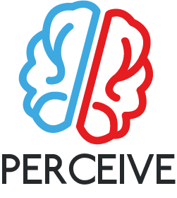 Aim of PerceiveThe aim of this concept is to show the importance of our sense and how different senses can react to different art styles. Main Aims:
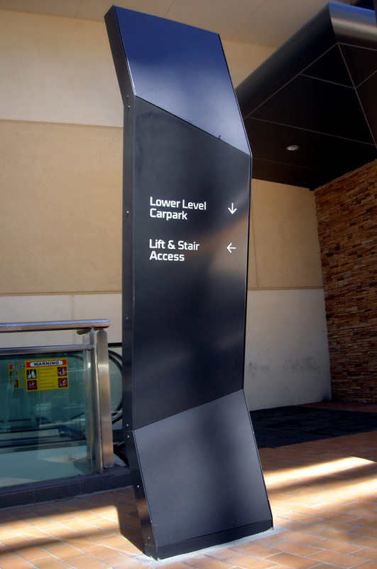
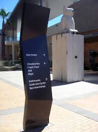
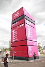
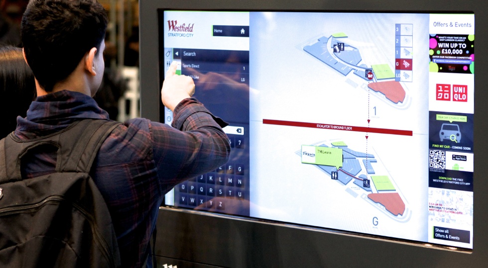
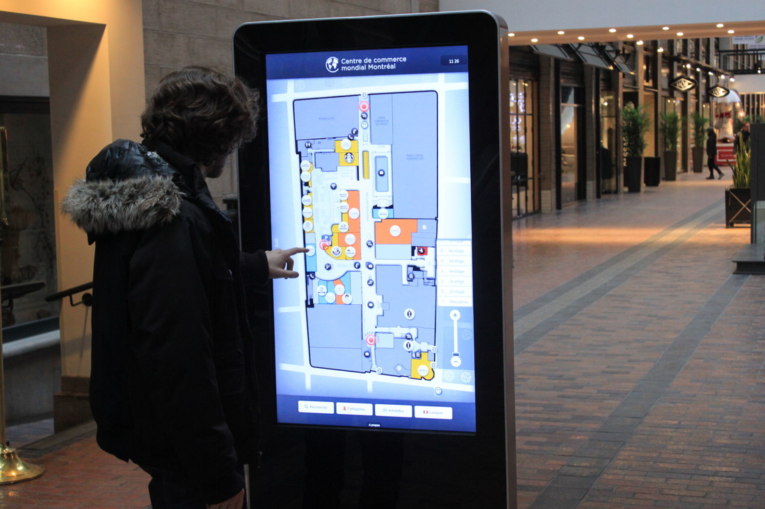
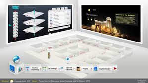
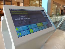
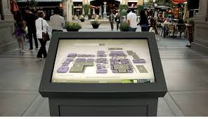
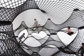
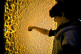
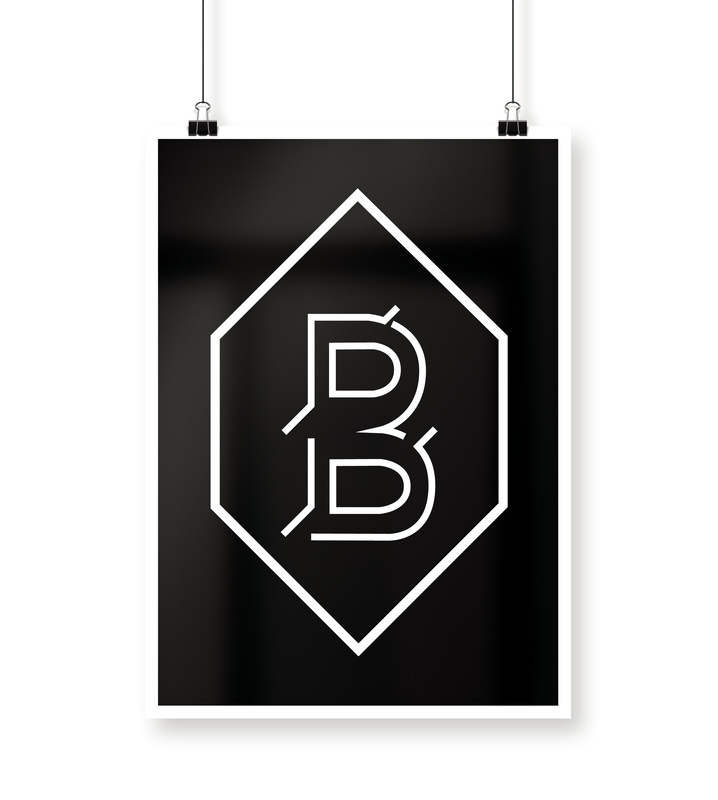
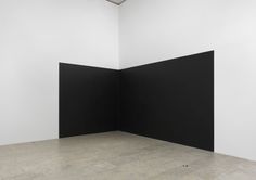
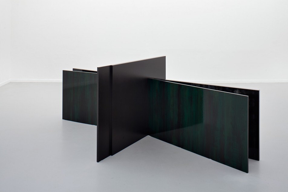
Inspirations Perceive Way FindingFor the way finding I wanted to introduce an Interactive way finding system where the audience can use the way finding the way they wanted. By positioning fixed monitors throughout the school one could use it as an App which is easier and would reduce the cost of paper and printing material.. As a mantra I decided to use Perception is Reality. InspirationInstallation & Projection InspirationsFor this concept I wanted to focus more on typography so I decided to make a typographical logo with a basic geometric border. Since the concept is focused on minimalism as well I decided to stick with black and white colors. The logo would not contain any text so just the border and the letter in it. 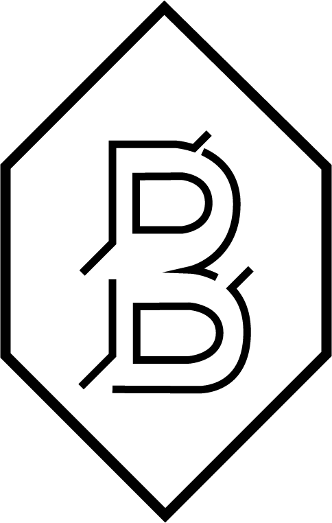
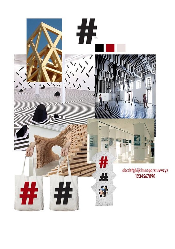
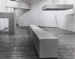
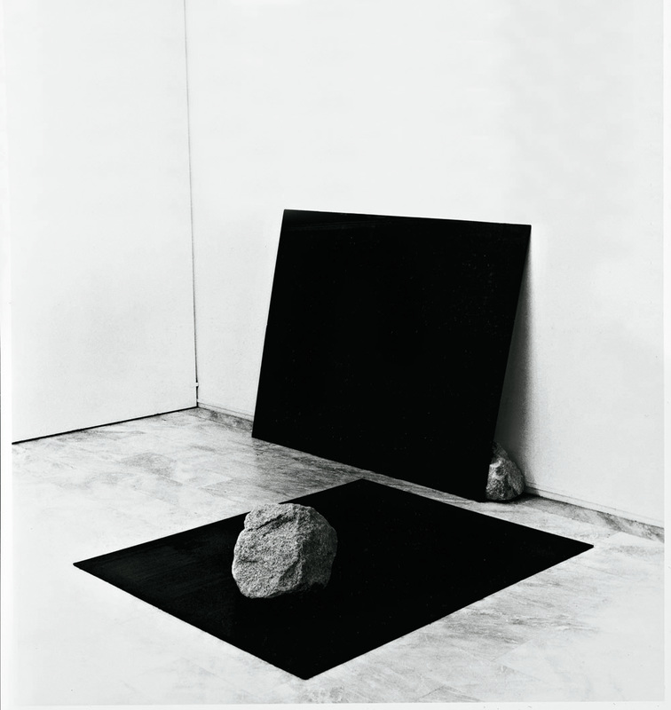
The aims of this concept is to present simple art installations and to show that the simplest thing can be the most interesting and beautiful. Main Aims:
I did some research on inspirations.
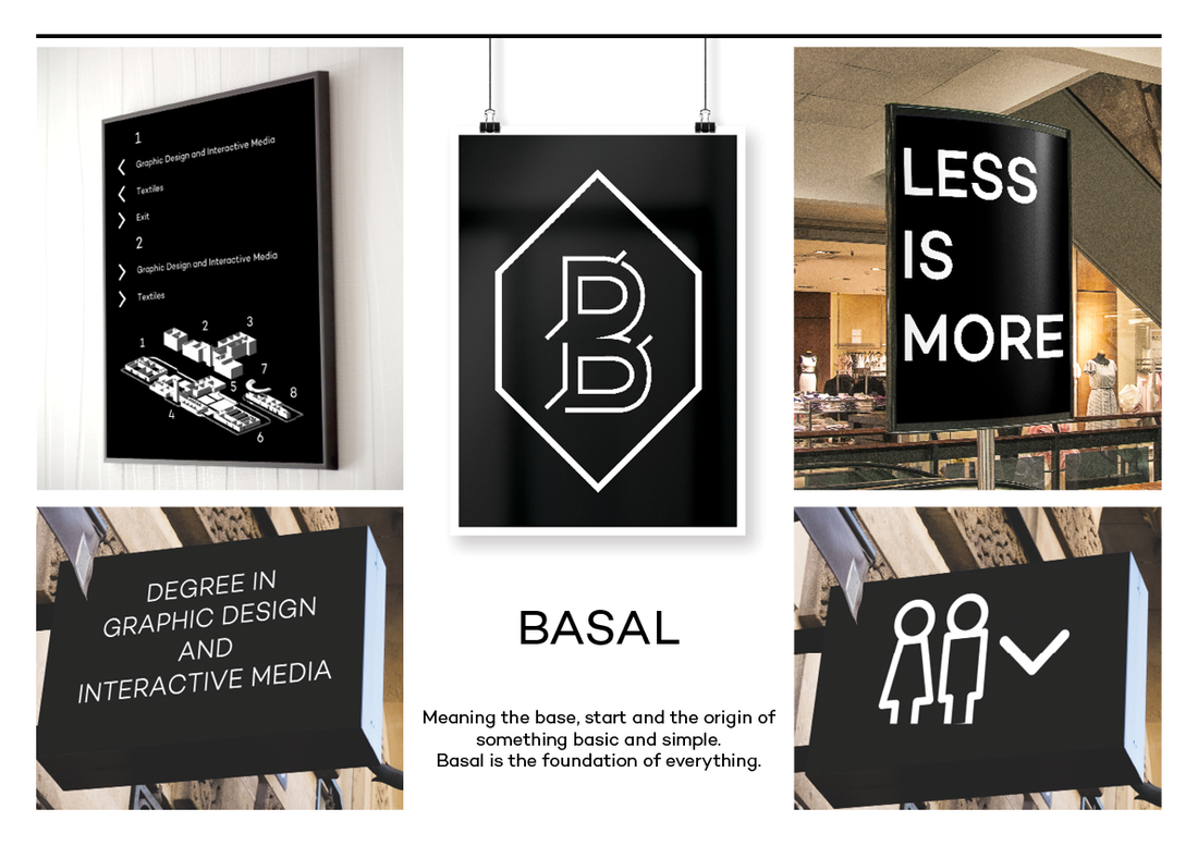
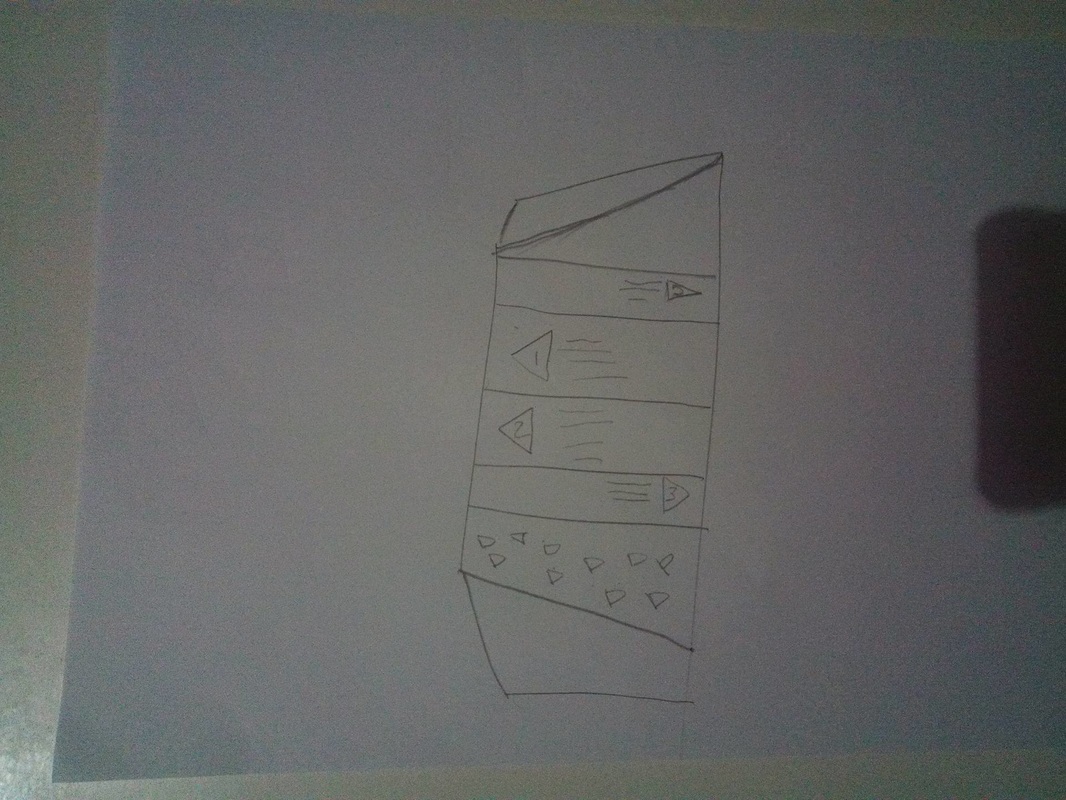
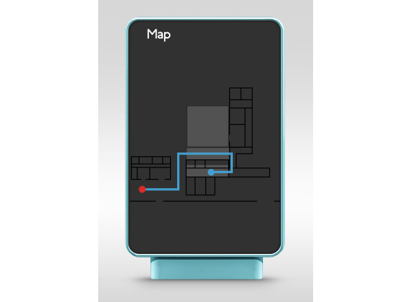
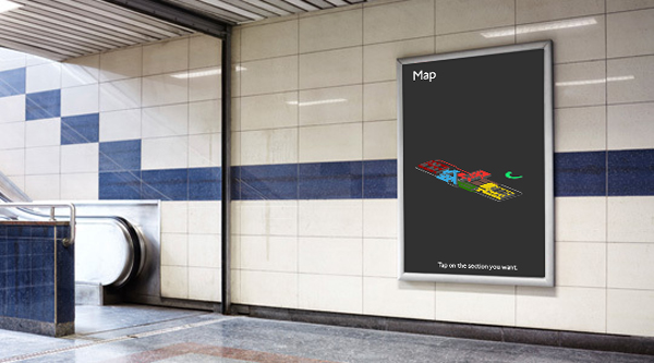
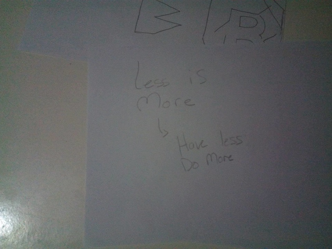
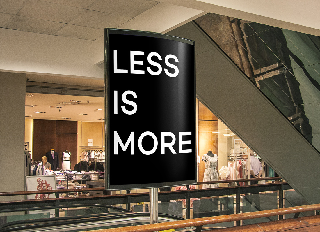
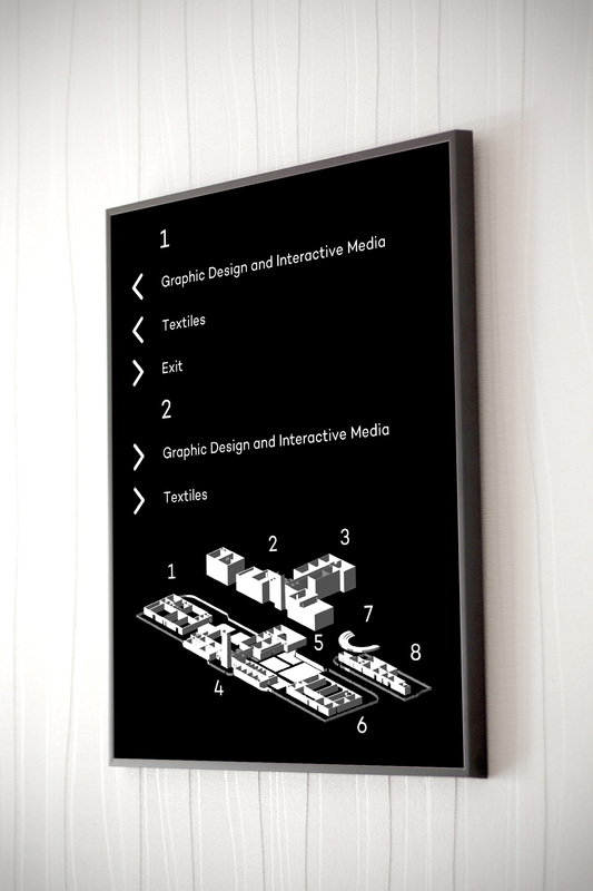
As for the way finding I decided to keep it simple by doing a 3D map of the school and divide it into numbered sections. The signs point according to the number and then you can see where to go according to each number. For the Mantra I decided to use Less is More which is think a good mantra for what I want to achieve.
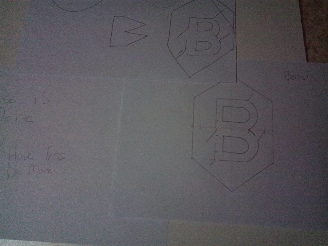
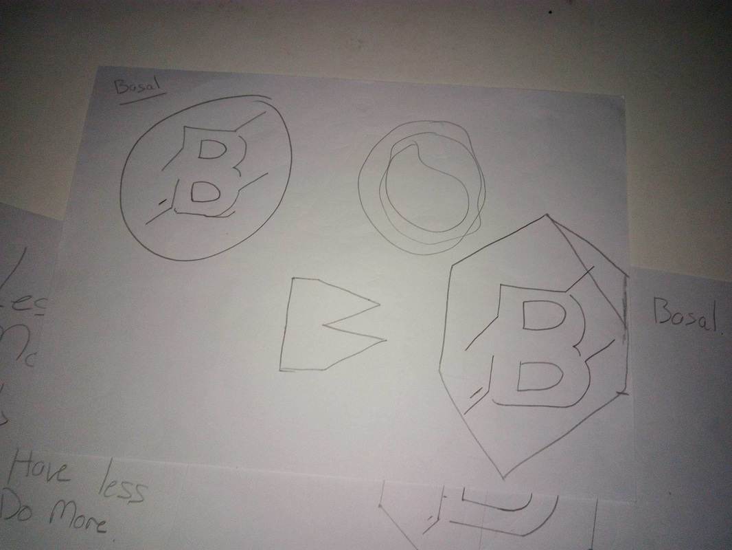
To start creating the branding of each concept I started by writing down the titles and a small description.
For this task I chose to work alone as I find it easier to work and divide work. I started by asking what is the exhibition for and why do we do it?
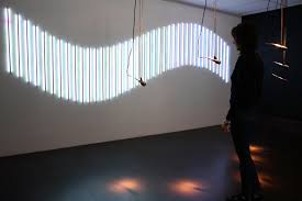
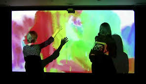
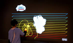
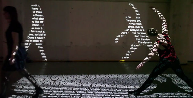
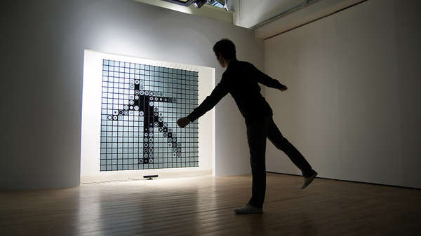
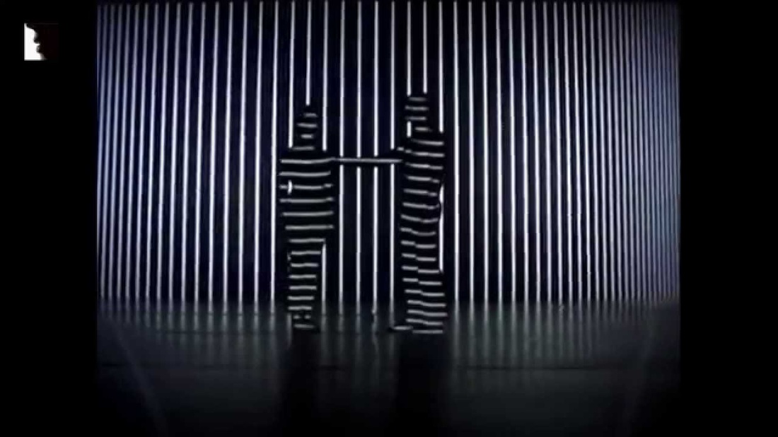
I easily found the answer and concluded that the exhibition is done to promote ourselves and the work we do. Although the school also exhibits its true self and what her students are capable of. After studying past exhibitions one can see that they had many good things but also had room for improvement. Couple of things that I liked from past exhibitions was that they once had the interactive projection which I used my self and was very inspired by it and would like to include it in one of my concepts. |