|
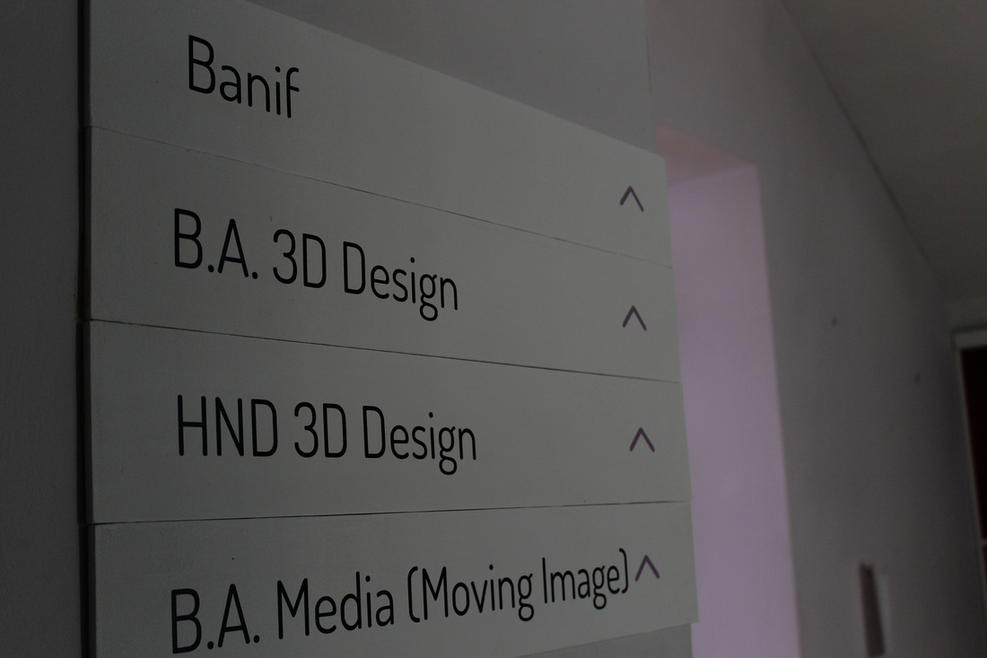
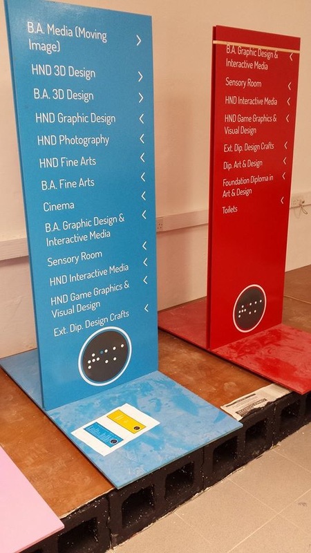
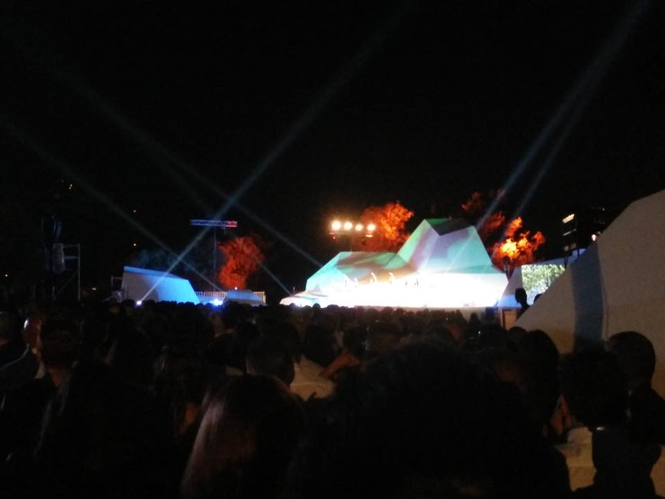
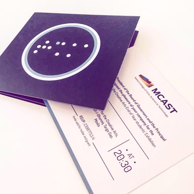
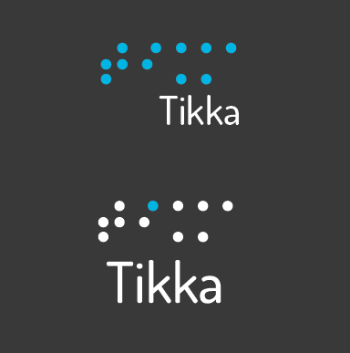
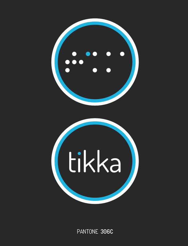
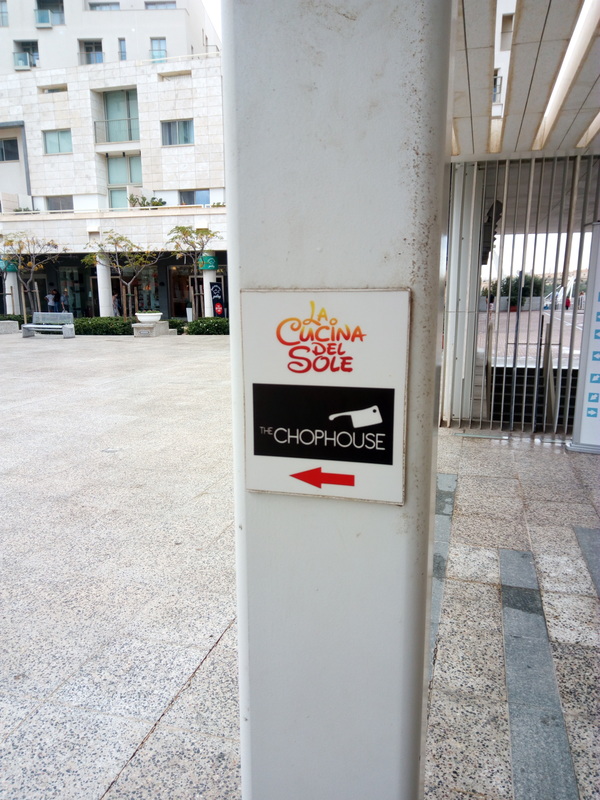
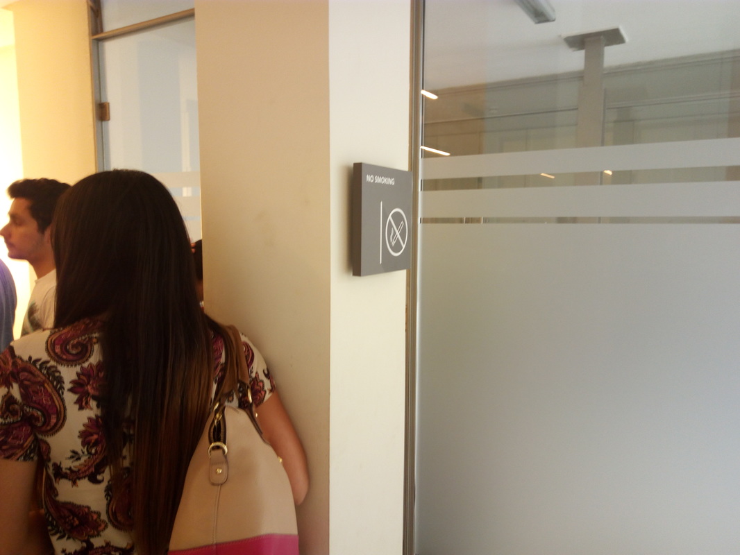
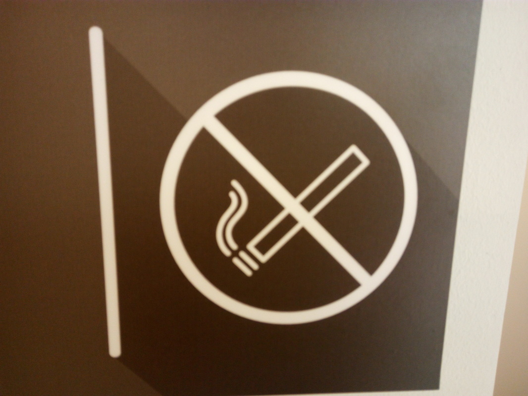
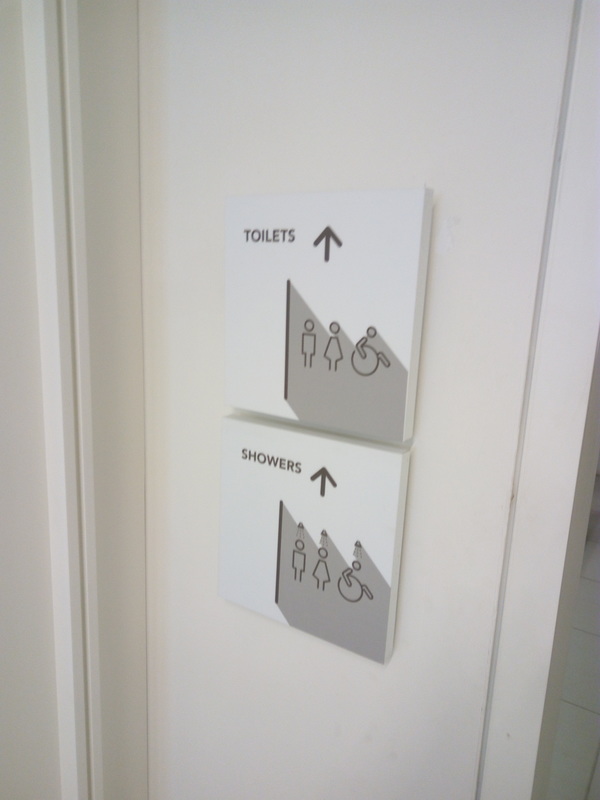
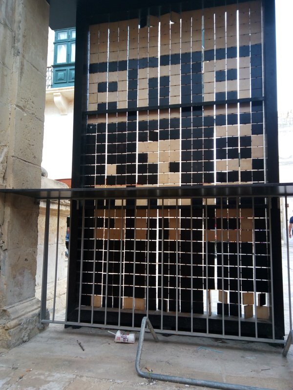
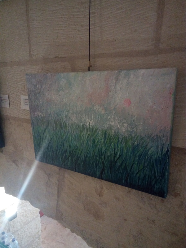
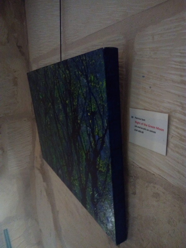
The Last year's exhibition was a successful one, a lot of people came to check out the work of us students. The overall branding about the Tikka, was very interesting and innovative. Taking into account that they had to include accessibility factors for the blind, the brail was neatly and discreetly integrated into the branding. Giving good reference to the theme they had to follow, Tikka was a very good workaround as Tikka means point, water drop, little. The way finding was very helpful as to find different rooms around the school and to follow the directions. The signage was very minimal with simple text and an arrow pointing in the direction. One thing that I always find a problem is the flow of the audience. I would personally design a specific route which the audience must take starting from a point and ending at another without being able to go back. Taking into account that the school corridors are not very wide, this would help the flow. The projection was interesting although I think that it could have had a little more animation. The stage was impressive using geometric shapes to create a 3D space and structure. but I wasn't a fan of how the stage had a huge ramp extending so far and I didn't really get the purpose of it. The light was good all around giving good sight to different works that where placed around the school. A very important aspect that was missing was the audio, I think if there was some kind of audio in the background around the school it would enhance the experience of the viewer.
0 Comments
This the Mercedes Benz S-Class W222 Russian Premiere event.
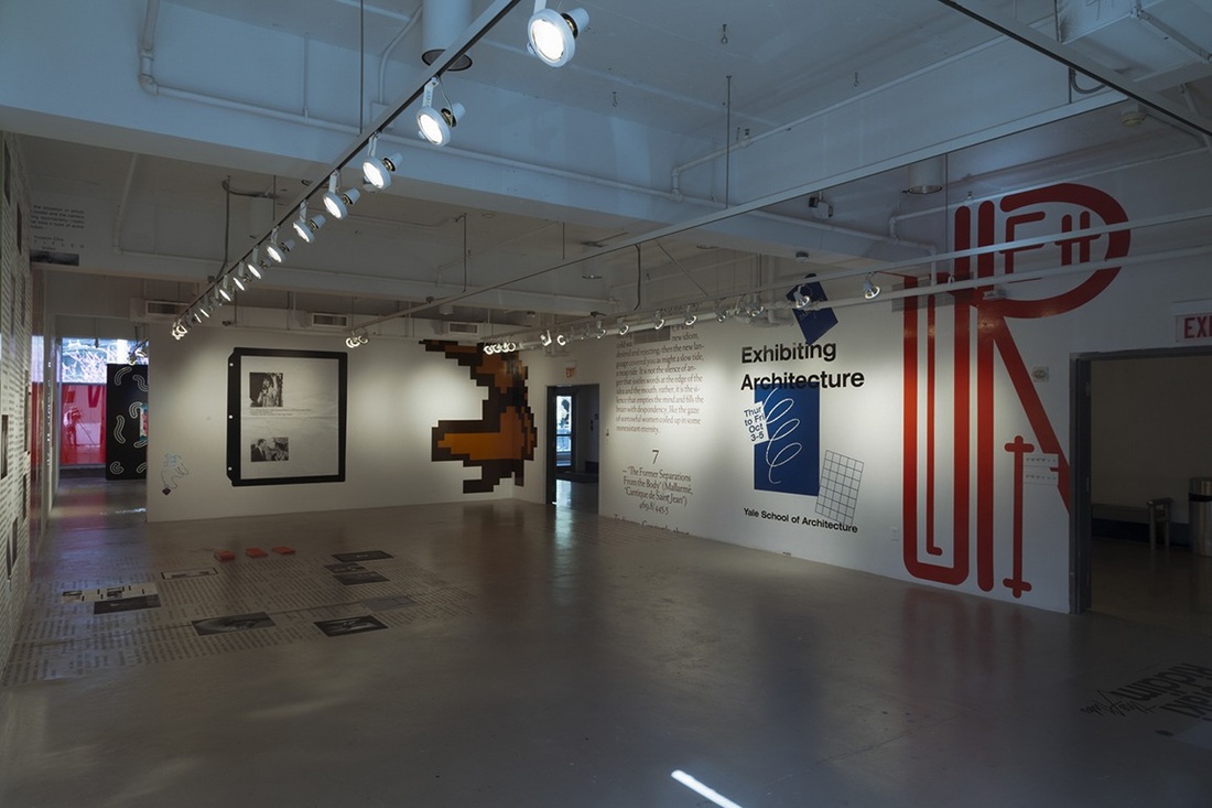
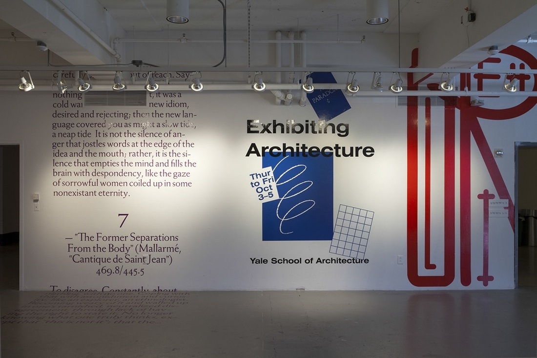
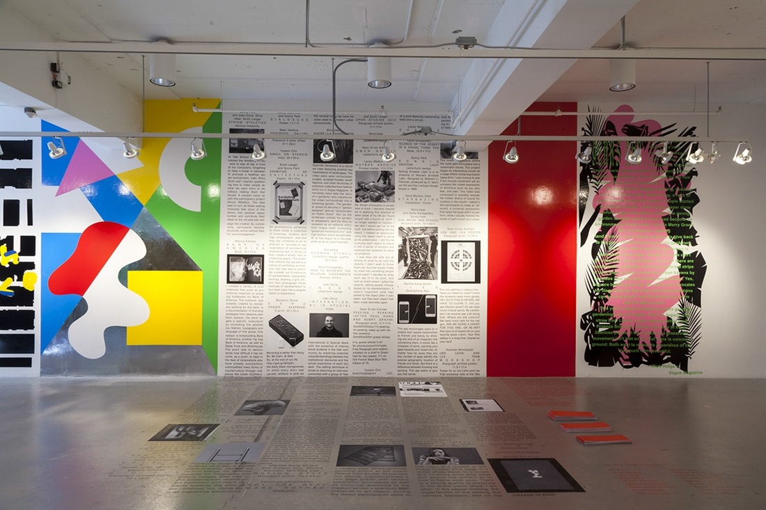
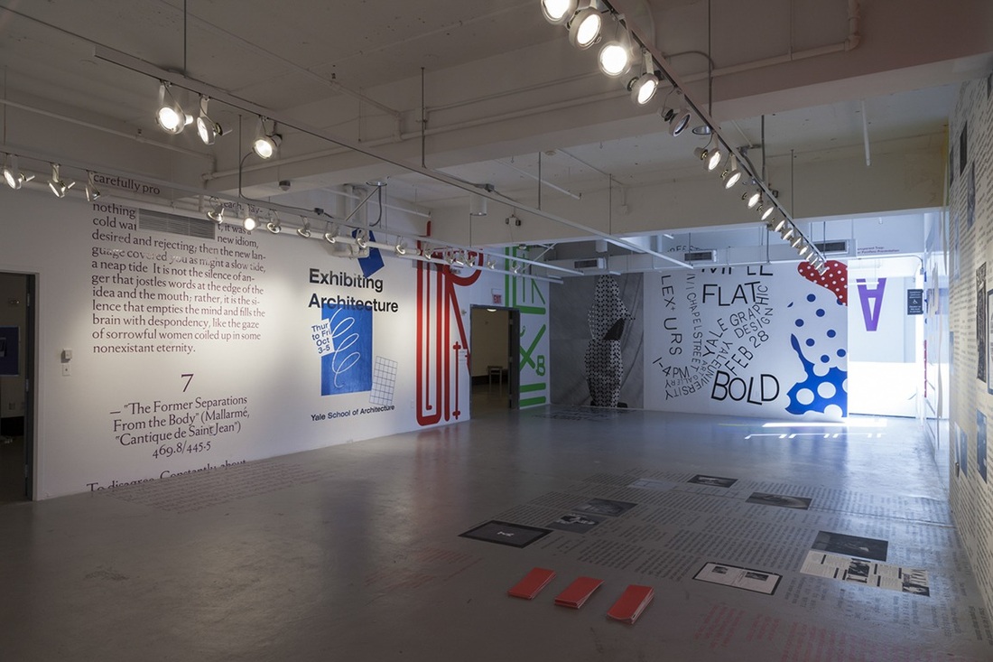
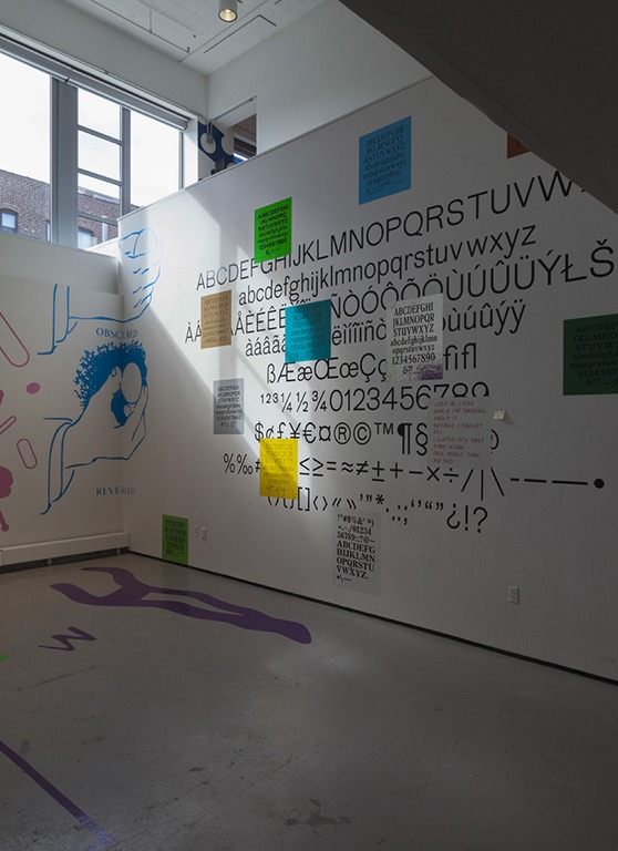
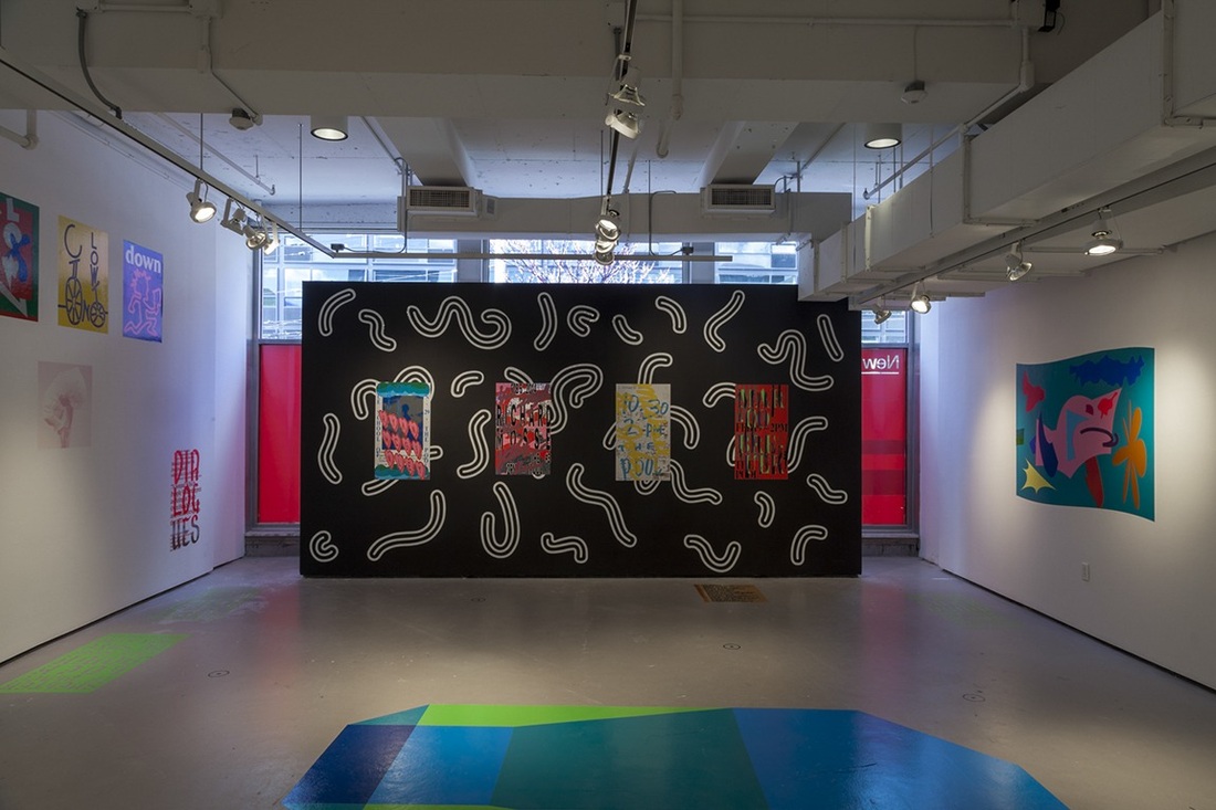
In this event the projection was projected on a canvas and on a car itself with the canvas acting as a wall. Also it gives out the perspective that the viewer in just looking at a car from a side view just anywhere. What I found very interesting was that the audio and music was all live in synchronization with the animation. The different effects on the war are very amazing and gave me a couple of ideas for other projects I am currently working on. An idea I thought about since we will be doing the end of year projection will be to extend the projected surface not only to a wall but also to the ground or a 3D structure,. this will give the animation an innovative aspect and also three dimensional. New Business is a Yale School of Art’s 2014 Graphic Design MFA Thesis show, which was on view April 29–May 8 in New Haven, CT. Aside from each student’s printed thesis book, a takeaway catalog and minimal seating, the entire show was rendered with adhesive vinyl. This exhibition shows graphic design work on every part of the exhibition place. The exhibition work are all adhesive vinyl, attached to the walls and also on the floors. Meaning that one can start reading from the wall and than continue reading on the floor. The exhibition space is quite large and spacious and one can easily walk around. There are many typographic elements all over the images. There are phrases and experimental typography everywhere. The typography is used as part of the design, using letters and words to create a creative design. The whole space is painted in white which acts as a background of the vinyls. There are few unattached walls in the rooms which have a different style to match a specific vinyl.
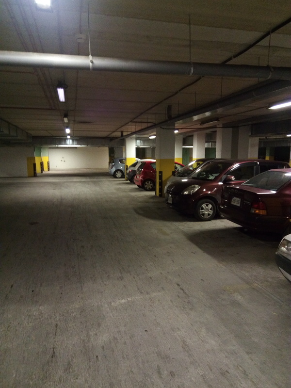
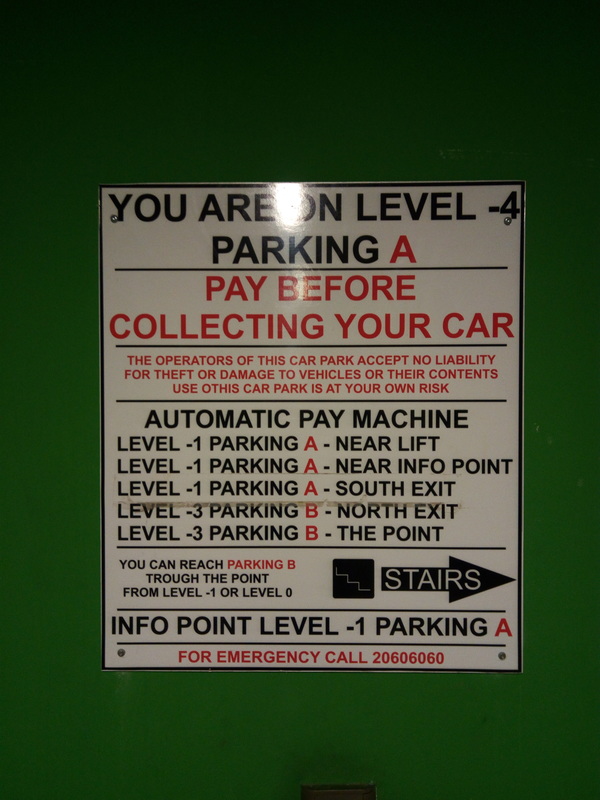
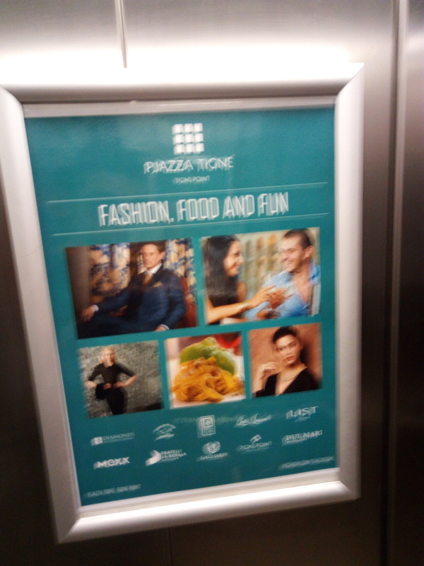
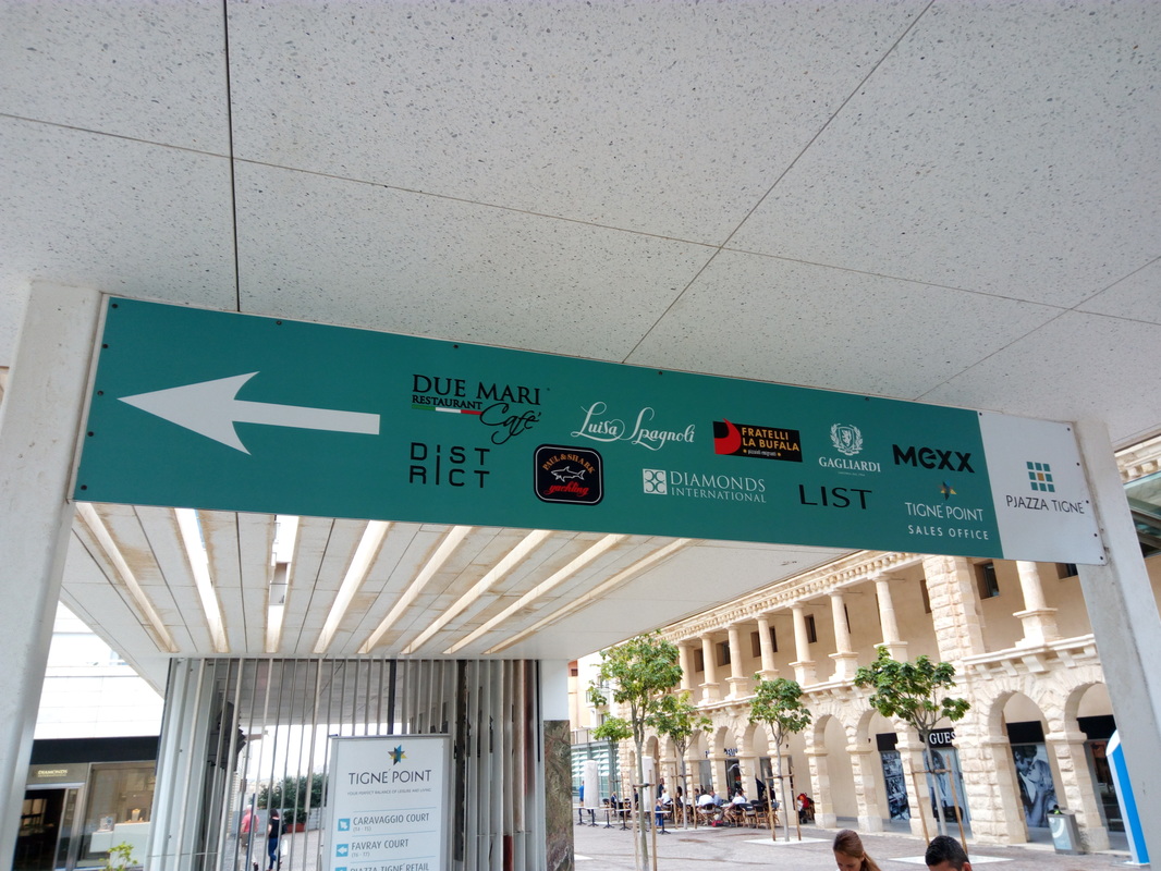
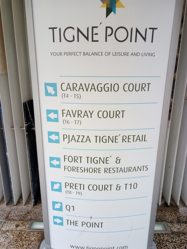
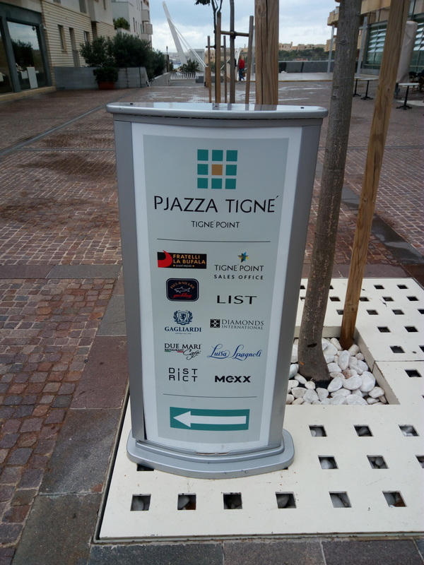
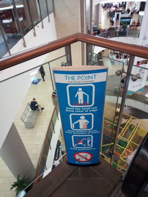
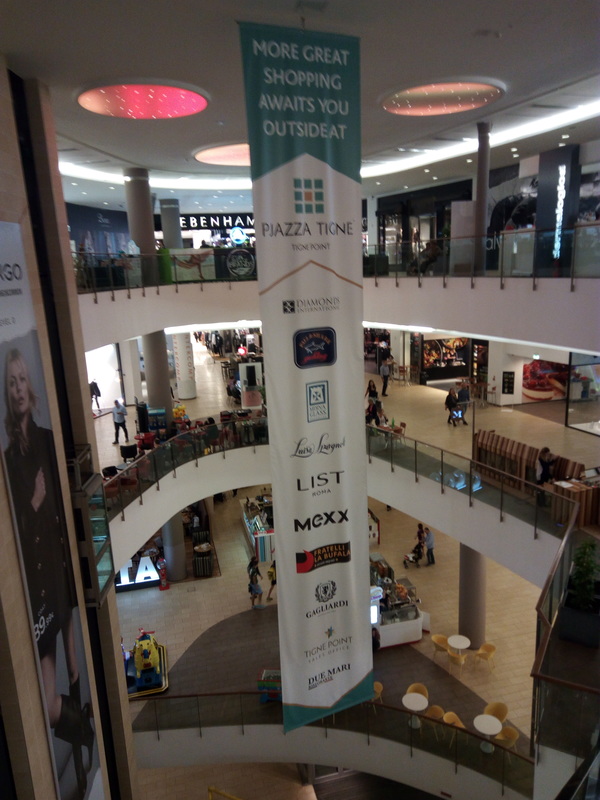
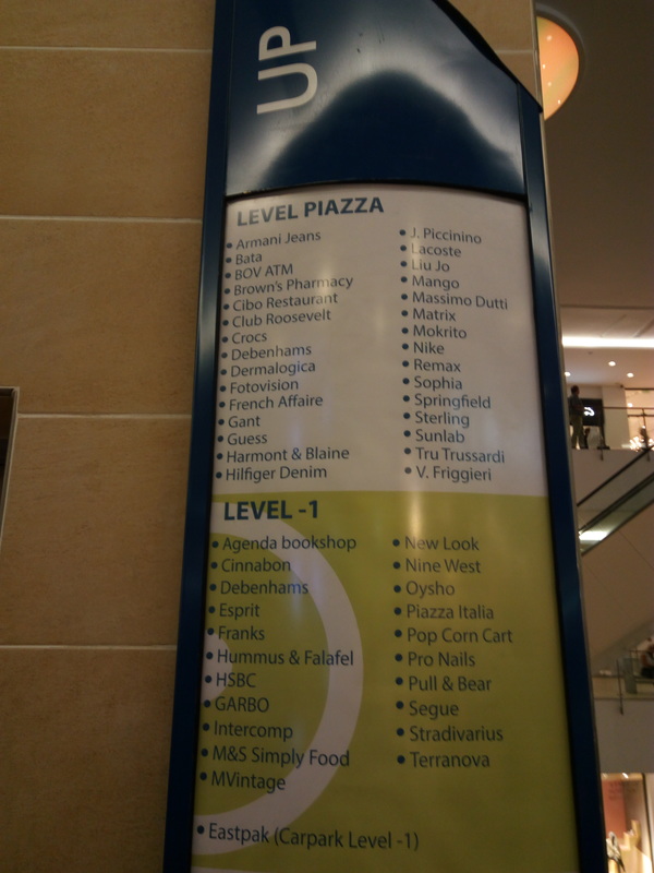
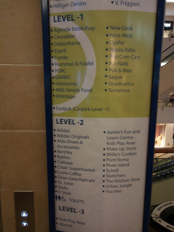
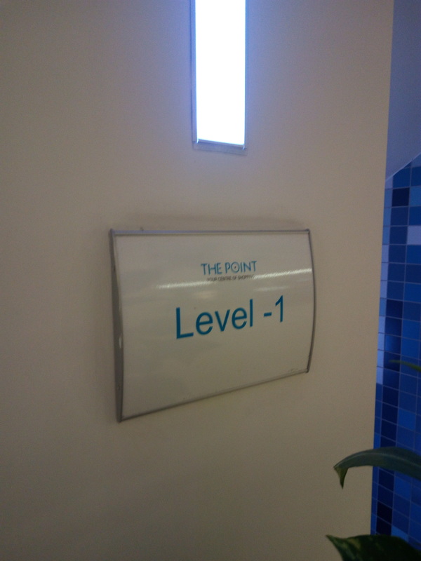
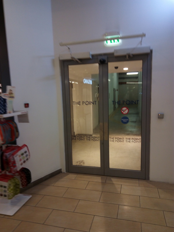
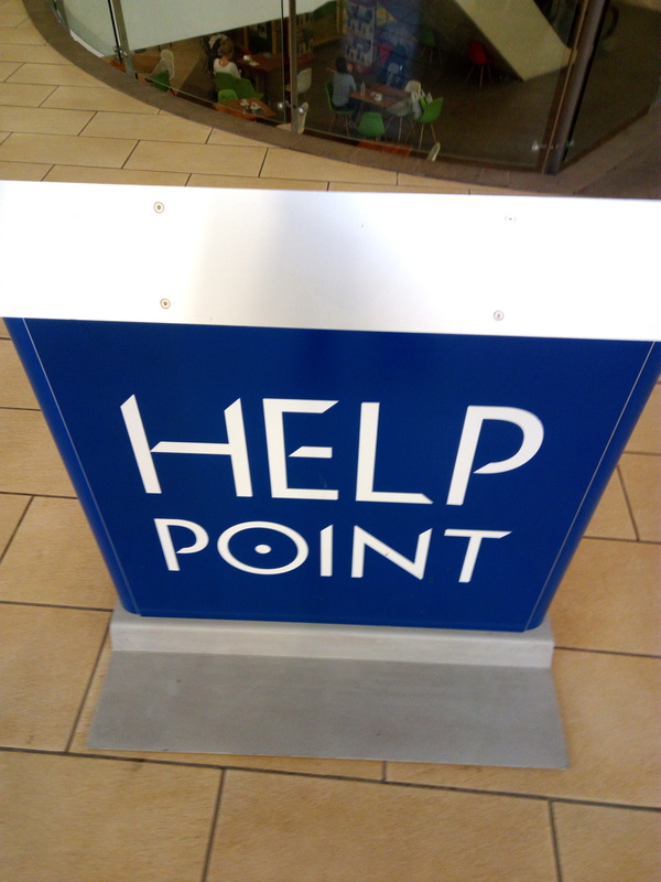
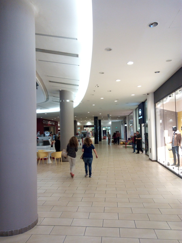
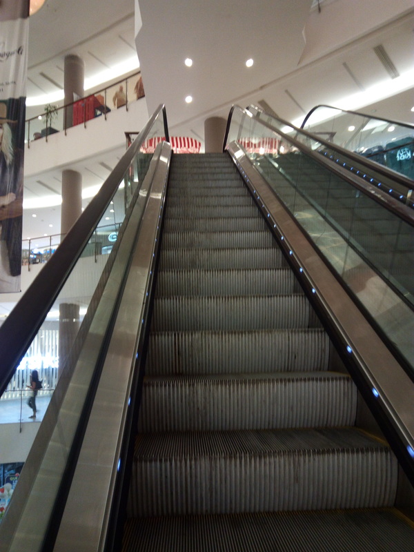
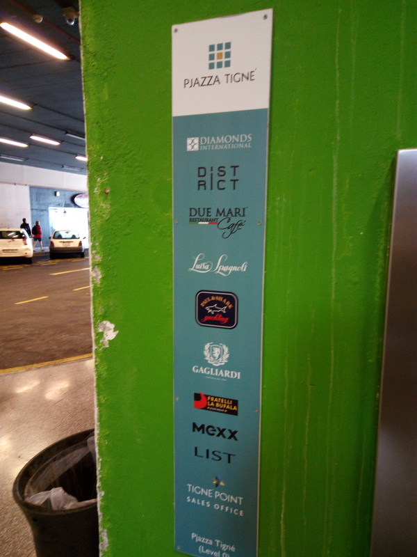
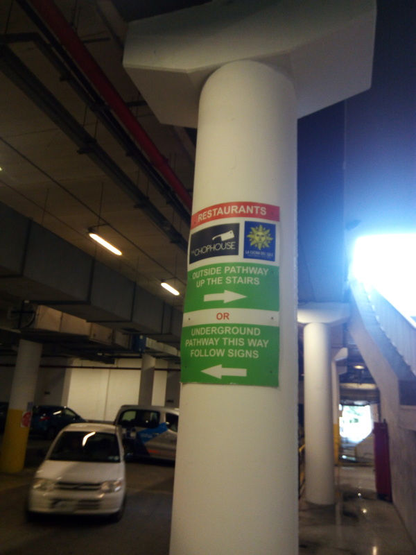
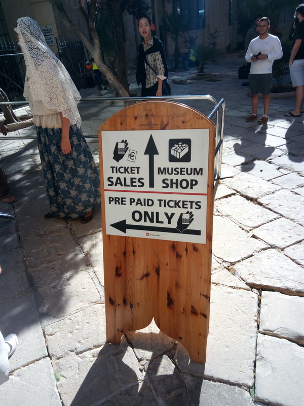
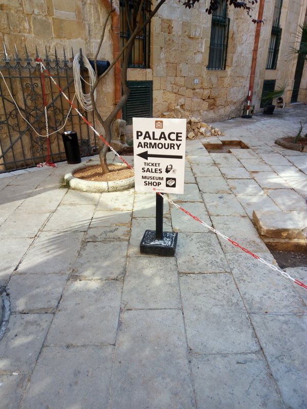
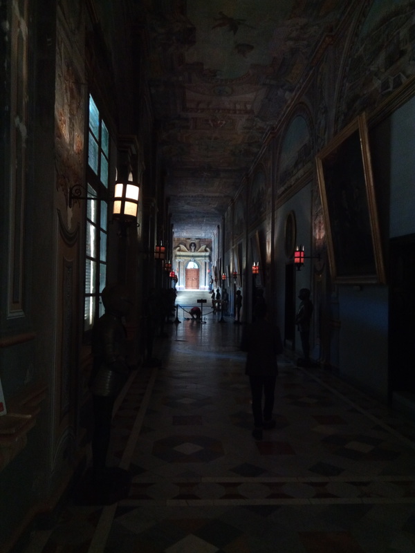
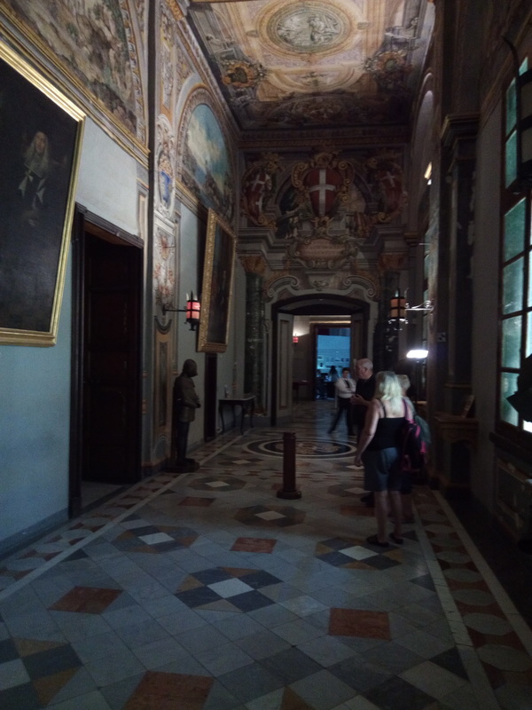
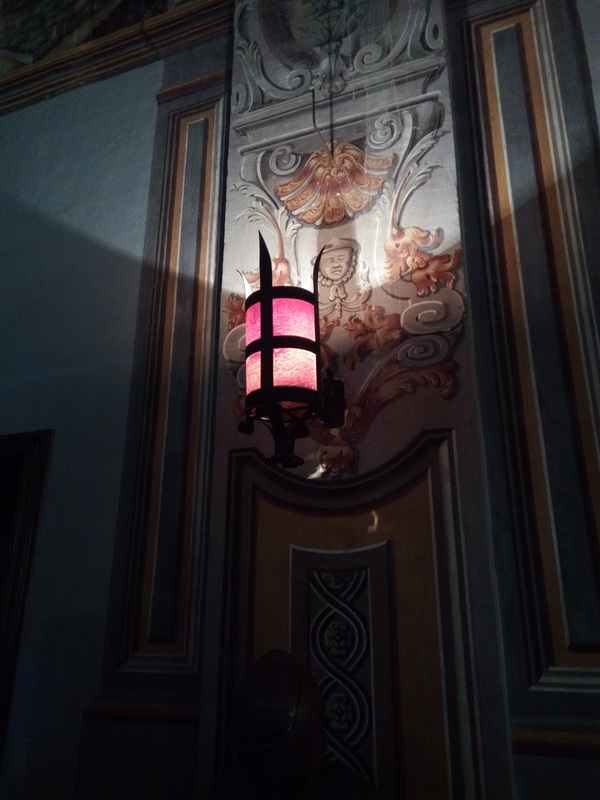
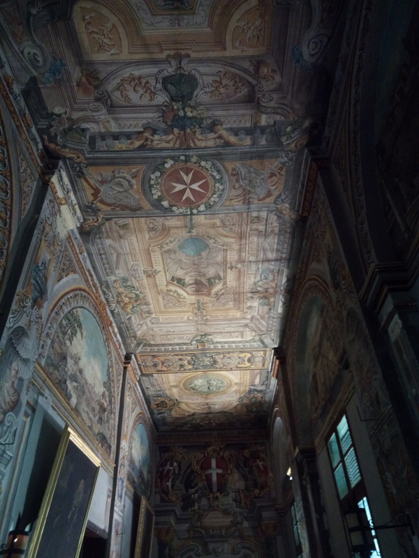
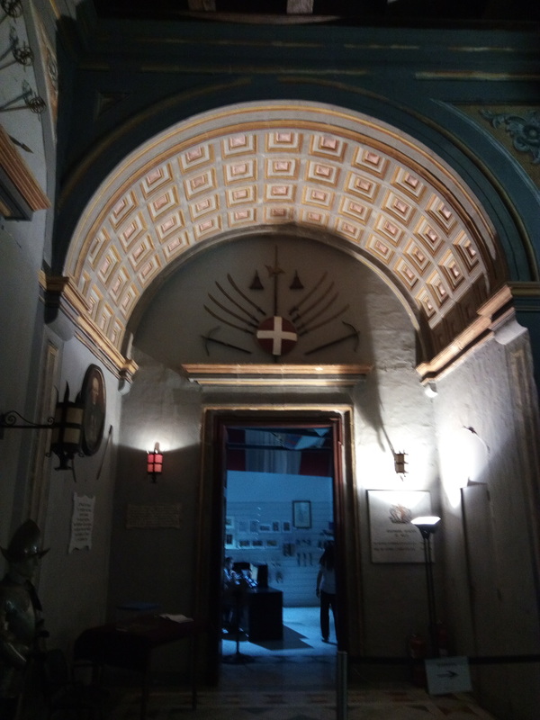
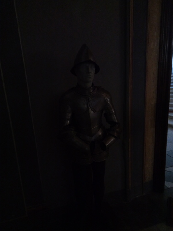
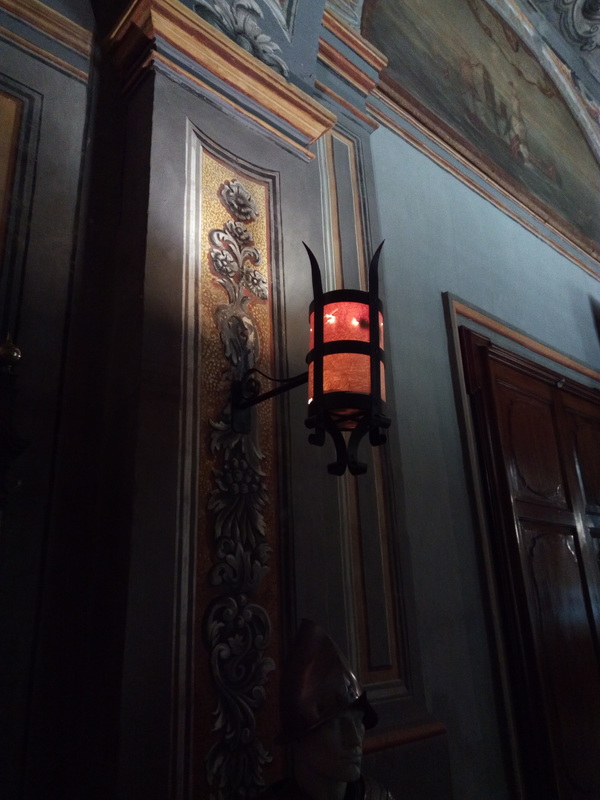
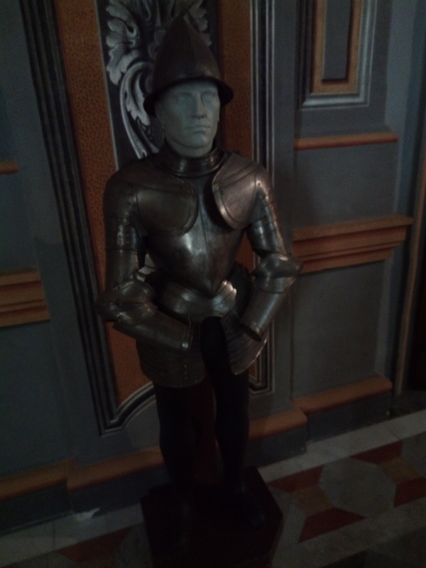
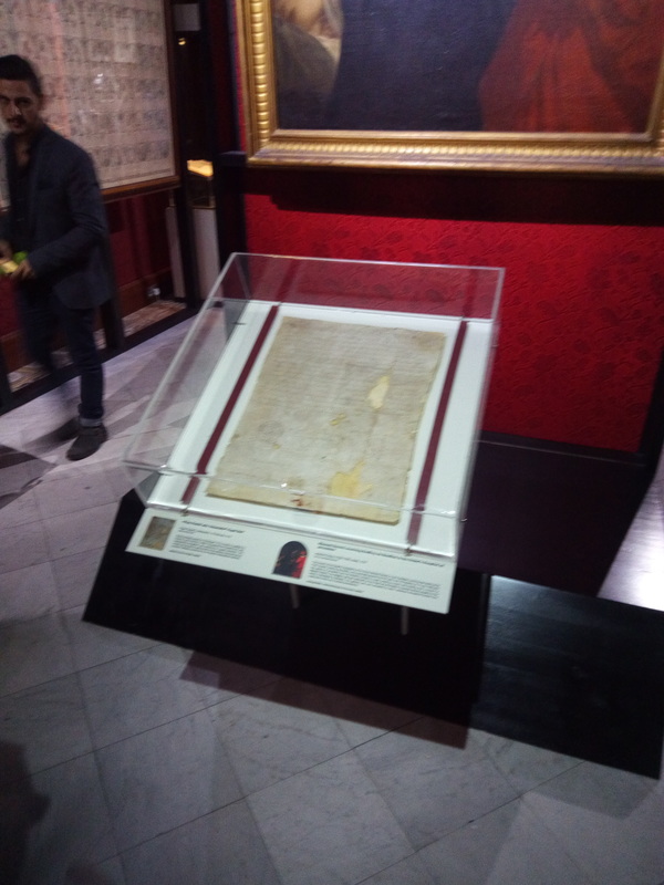
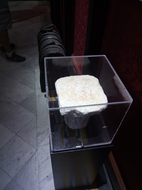
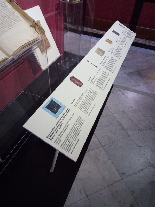
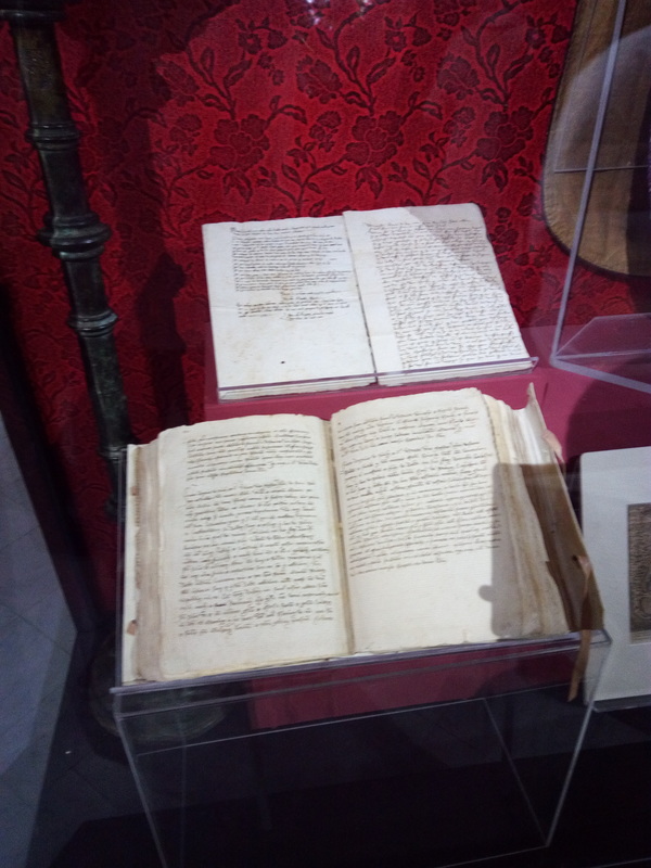
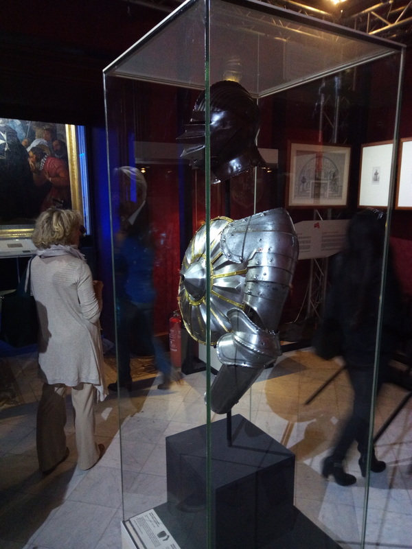
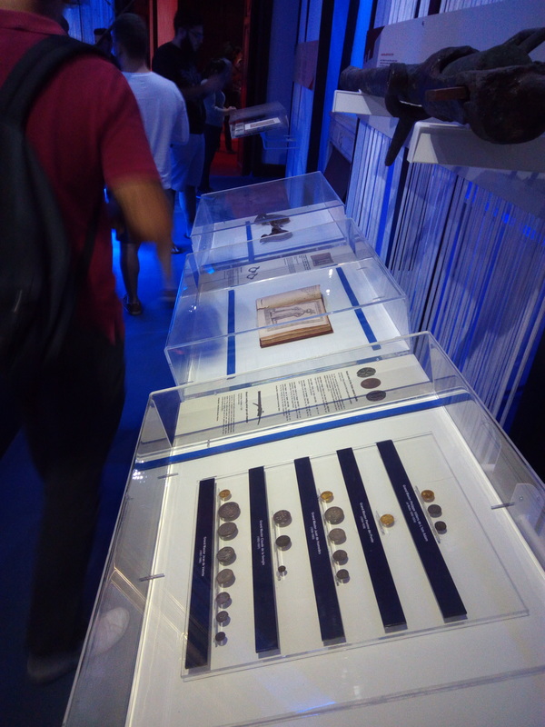
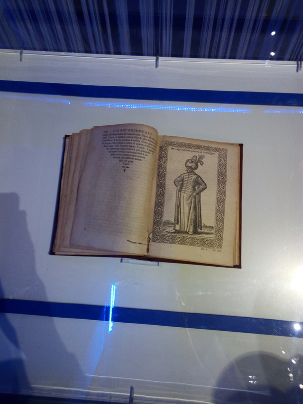
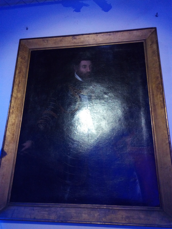
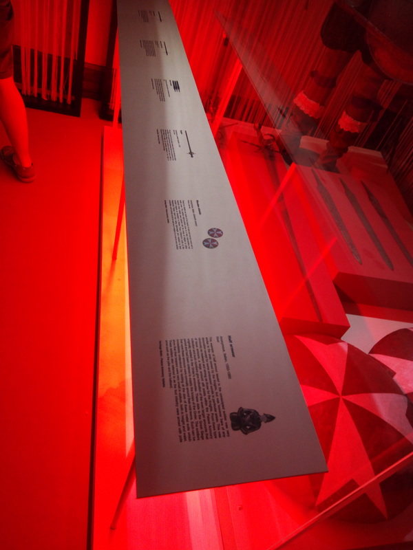
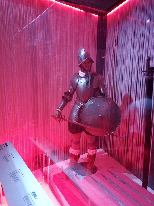
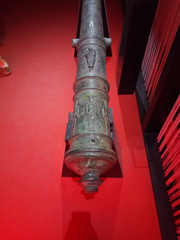
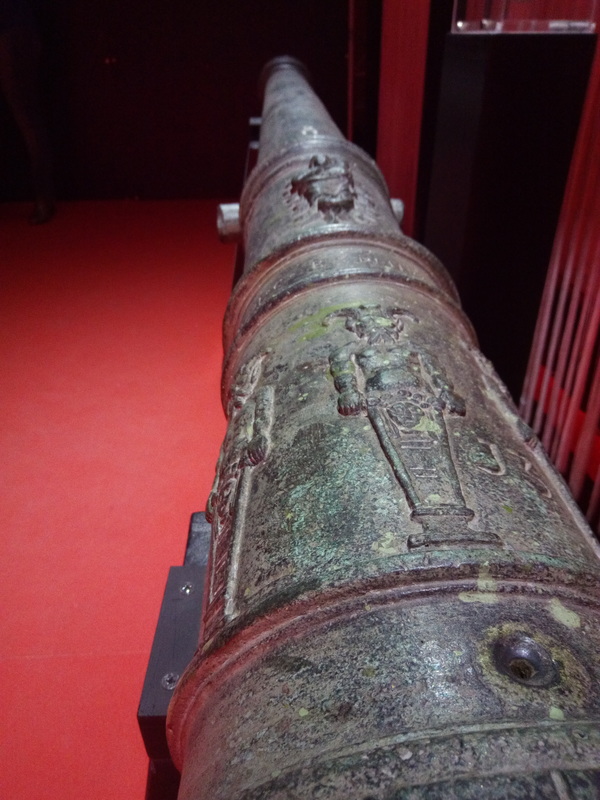
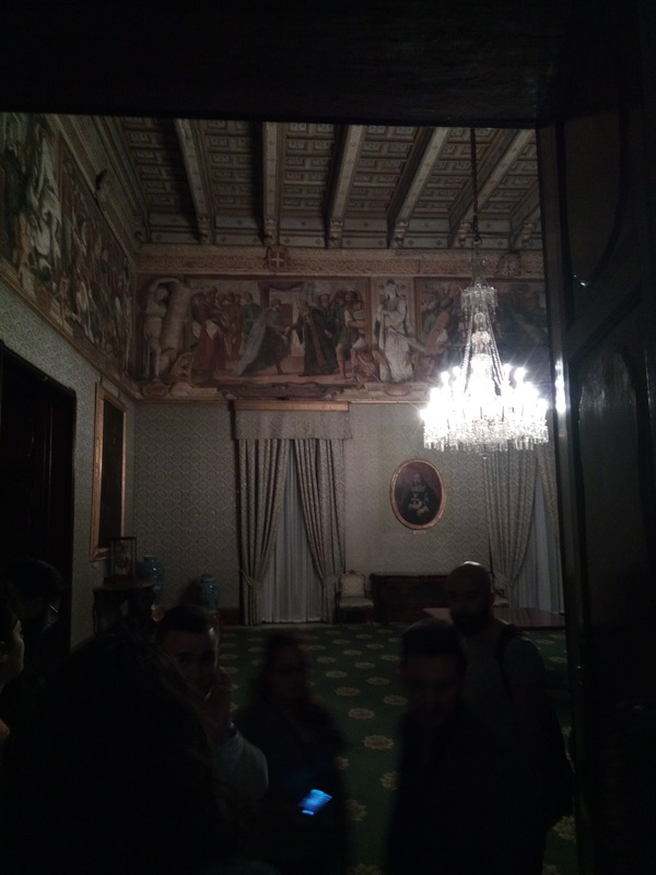
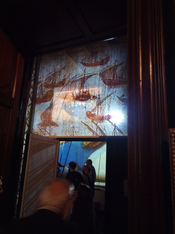
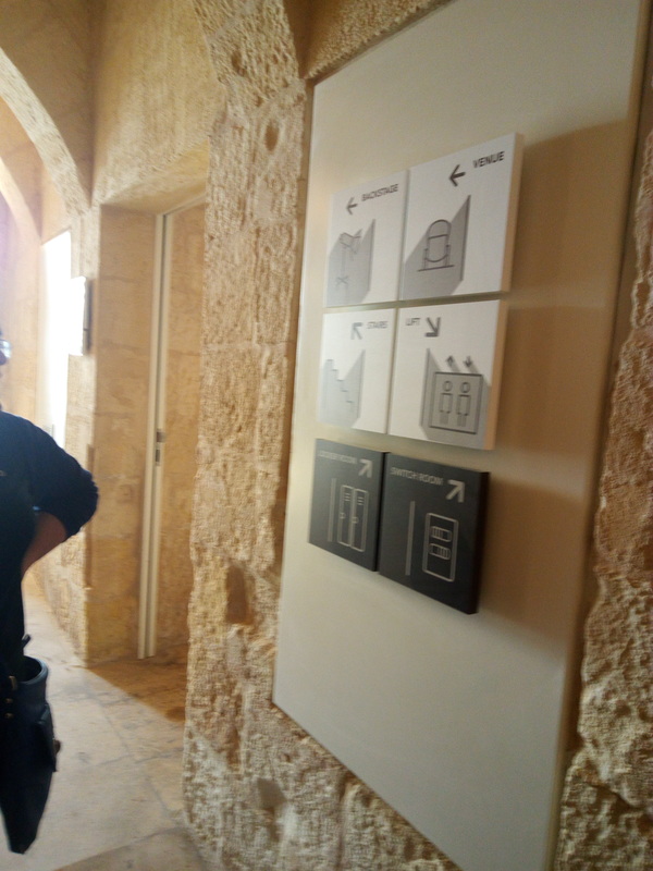
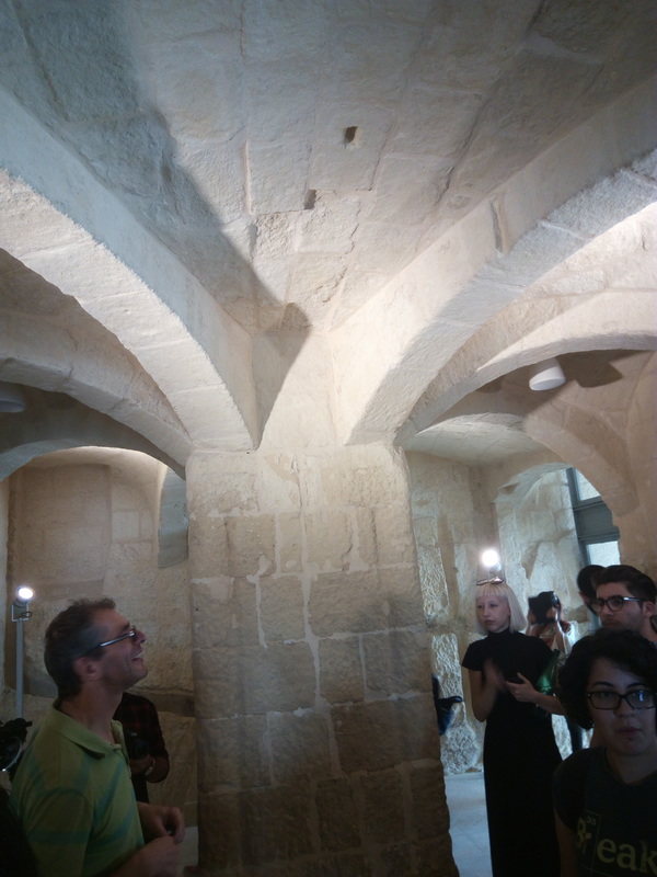
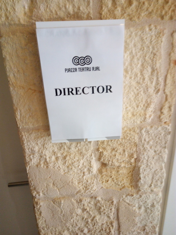
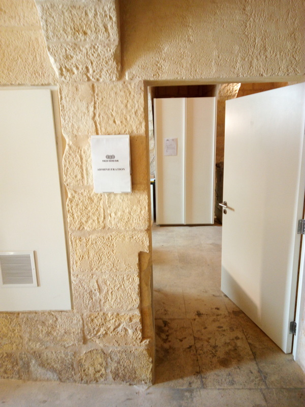
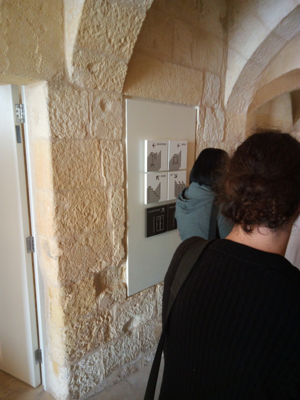
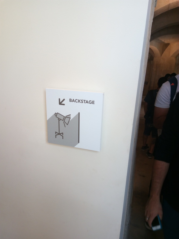
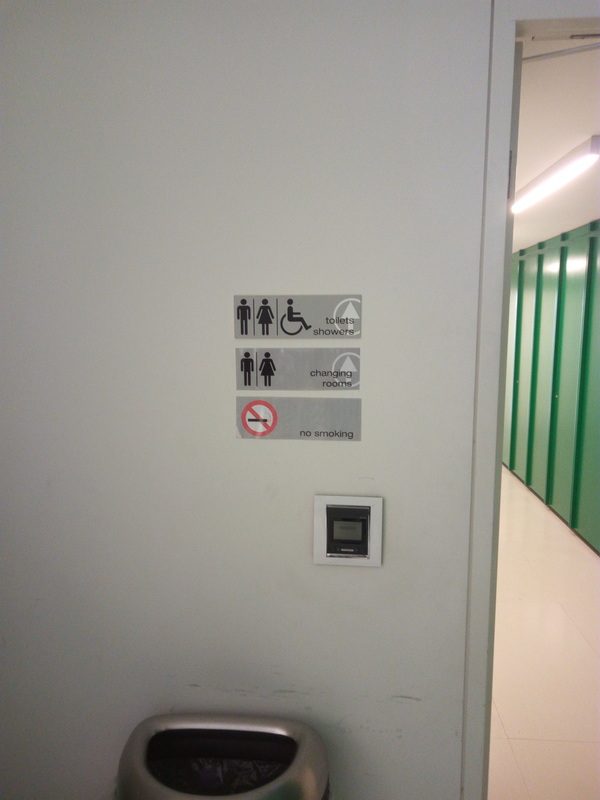
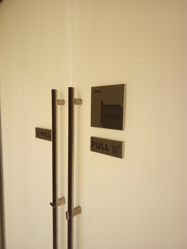
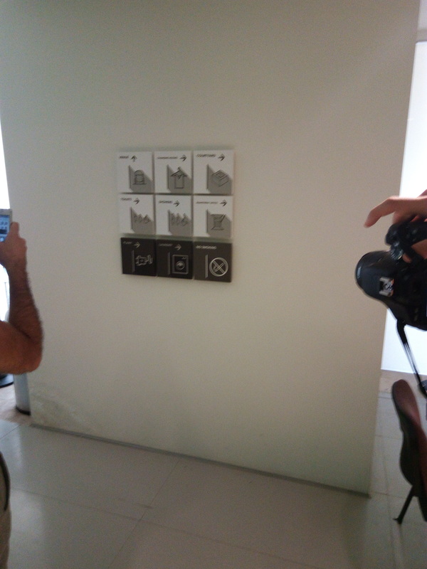
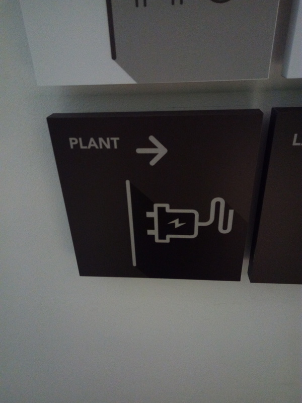
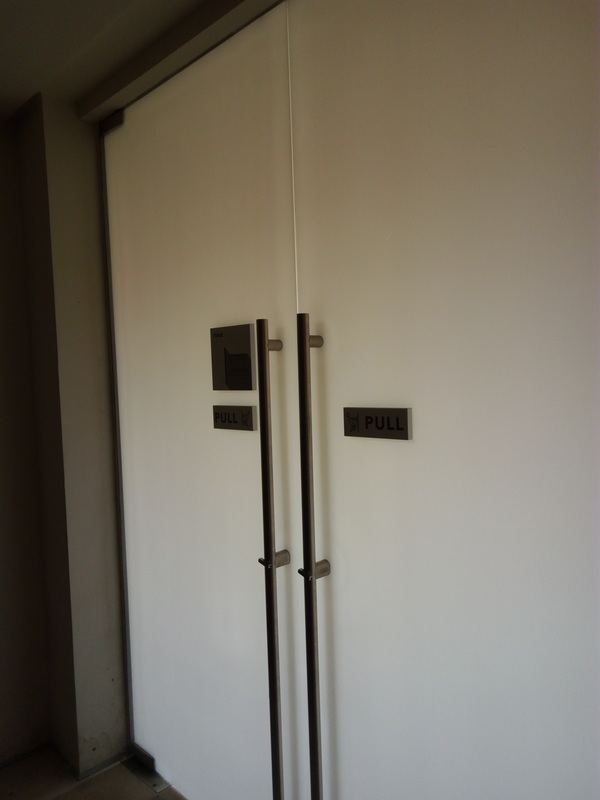
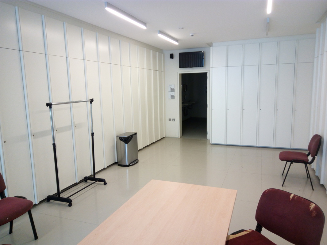
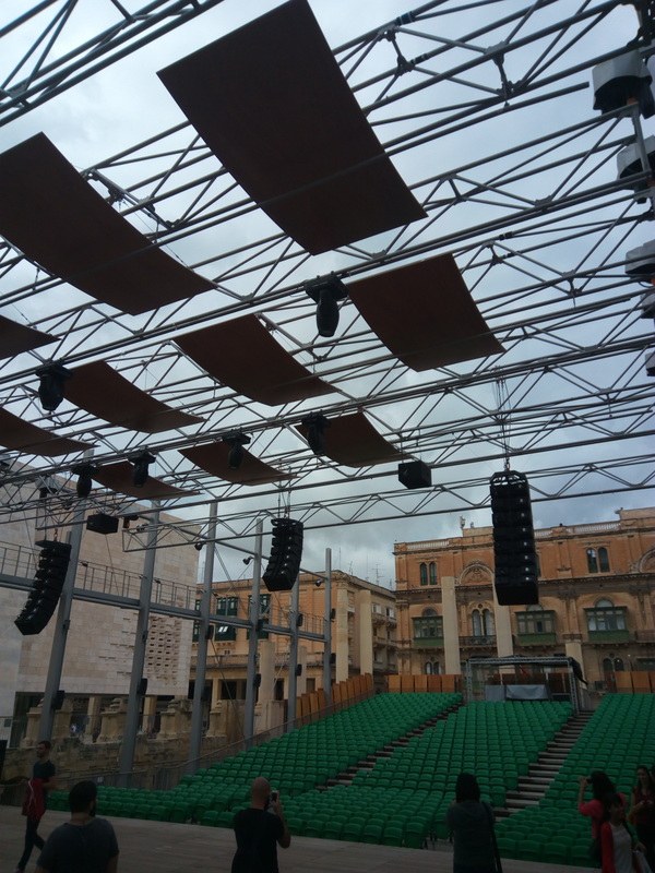
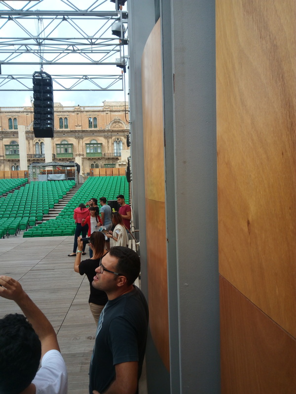
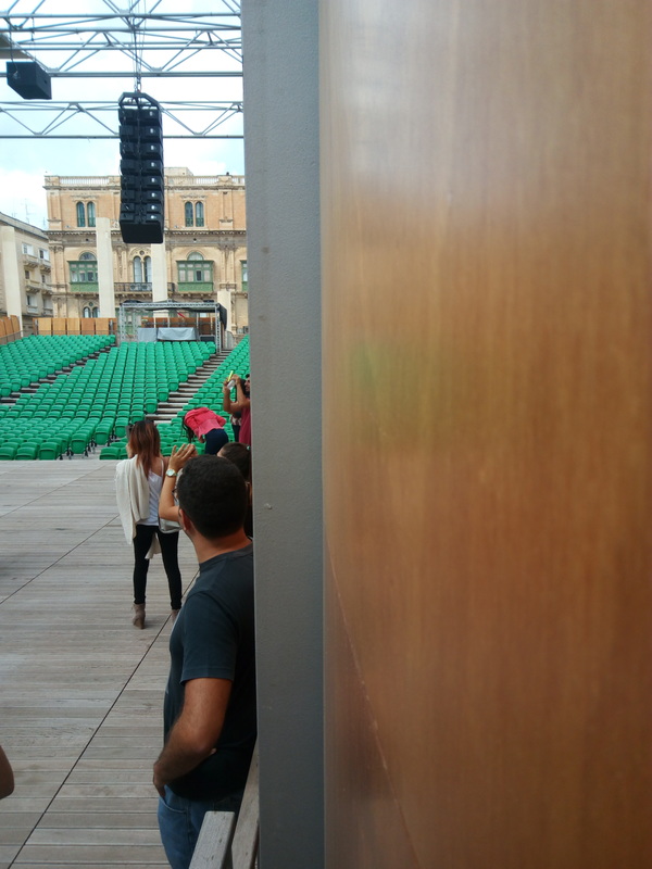
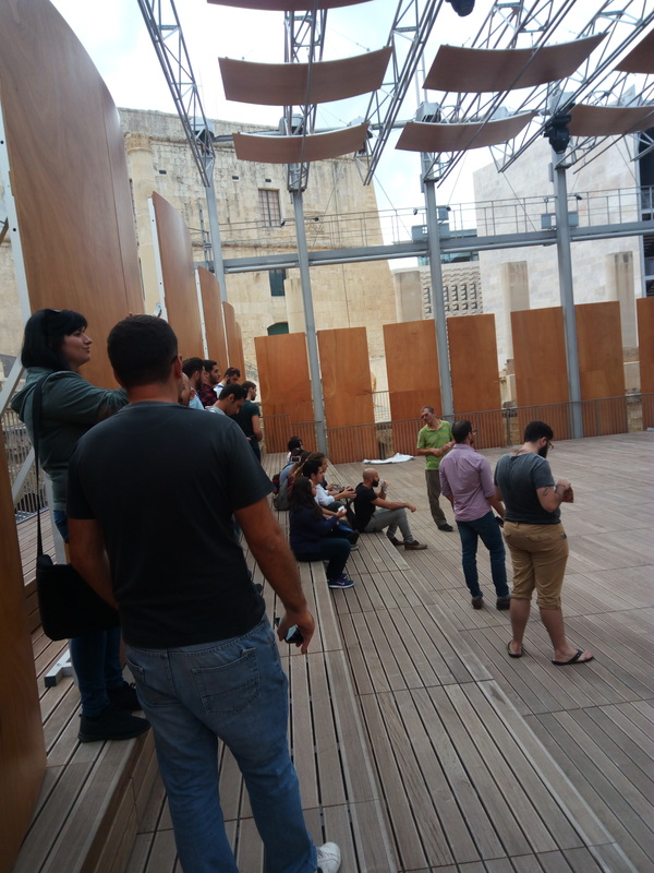
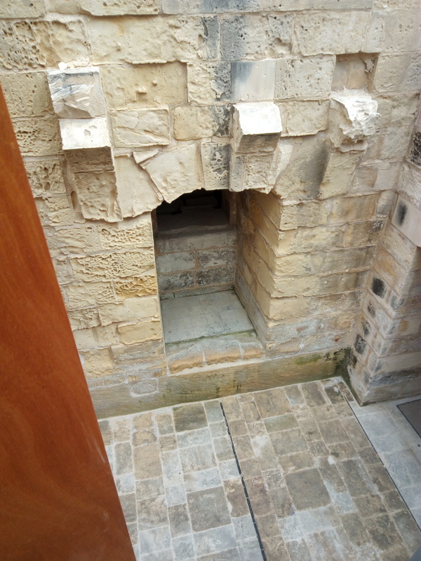
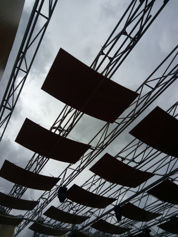
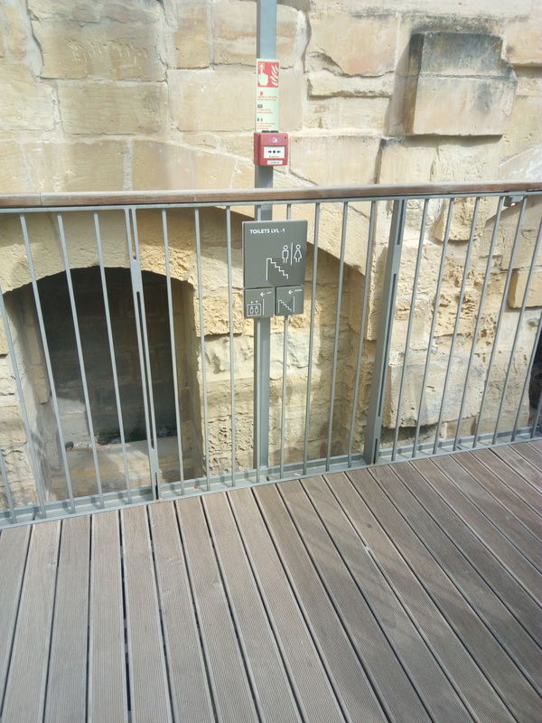
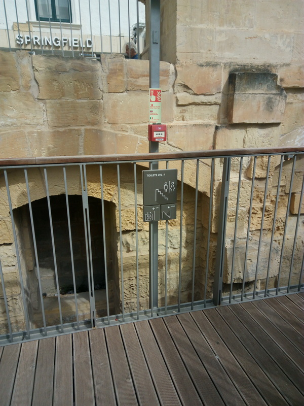
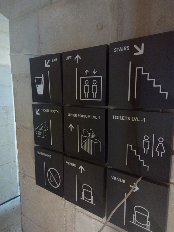
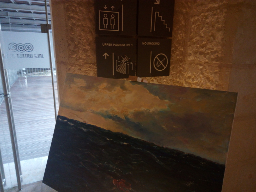
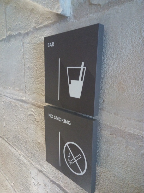
The light source is coming from spotlights which are attached to the ceiling. In some pictures one can notice that there is natural light which is coming from the windows that gives life to the rooms. There is no specific color scheme to the exhibition, there are shades of white and grey, but each vinyl has bright colors which makes contrast with the backgrounds. New Business reflects that contemporary idea lets the viewer be able to imagine and be creative with his own mind. This exhibition doesn't have a specific target audience but I think that people who are more into design, digital graphics and typography would appreciate this exhibition more. There are signs which clearly state what are the artworks and also where to find what. Tigne Point is a large shopping complex in Sliema. It has different shops inside and also outside from clothes to cafe's restaurants and also a 4 level car park. I started from entering the car park with my car and at first the way is pretty clear, with the way out signs and parking places signs. IT is quite easy to follow. I parked in level -4 and headed towards the elevator. What I found strange is that there are no signs to tell you what on every level and which is the ground level which in this case is Level 0. Once I got to level 0 and out of the elevator there is a huge sign telling you where is what and it very easy to understand and simple to read. I headed inside the complex and I found an interactive map to check different shops you might want to visit with some information on each and on which level they are. Inside the complex is a completely another story as directions are found everywhere even at the elevators that are inside the complex. You have a list of everything grouped by at which level they are, With music in the background it crates a very good and comfortable feeling staying inside and also with climate control system it is very cosy. On my way back I followed the directions to pay for my parking ticket and till that point it is very easy to follow. The hard part is that you have to be careful from which side you exit as that might lead you to another part of the parking. The parking is divided into different sections and one must be careful from where to exit. After some time figuring where I parked my car I used the elevator to go to level -4 and Exited the car park with out any problems. The navigation of the complex it self is very good and easy to follow and understand but the parking it self needs to further improve to make the experience of drivers easier. Built in the 16th century, The grand masters palace was the main residence of the Grand Master of that time, La Vallette. It is now being used as a housing for the president of Malta and a part of it is open for the public to visit which is taken care of by the heritage of Malta. There is also en exhibition going on about old artifacts that were used in the Grand Siege, different weapons and items that were used by the knights and the ottomans. As one goes in the palace, it gets a little confusing where to go, but once you look on the left there are 2 signs that are very poorly designed to say the least, Once you follow these signs, the confusion gets even worse as they lead to another part that does not have any directions unless you notice a small desk to buy tickets from. Once the ticket is bought you have to go back from where you came from and go up a small staircase which leads you to the interior. The first thing you notice is that the lightning is very dim, which kind of makes it hard to see what there is and what not. There are signs to not take photos with flash, but I wonder how the photos will come out without flash. As you can see in the images, they are pretty dark. As you walk along the corridor you won't be seeing any signs which tell you where you have to go, so the signage was non existent to say the least. There weren't any signs telling you what is the name of the room you're going in either which I think the public should know. Progressing on the exhibition, this time it is the other way round, too much lightning is used and is focused on the painting hanging with the wall, thus ending up making the paintings not visible as the light reflected on them making them look like a miniaturized sun. With each artifact their was a small description which was brief but gave out the important details about each item. Its color scheme was good although it didn't much go with what was going on there. As you explore different rooms you can see different lightnings and experience different atmospheres. I believe that they could improve a lot of things starting from the navigational system to the lightning which caused major impact on my experience. The only thing that did not really bother me was actually the smell as it was pleasant even though there were some people running around. . The royal opera house was used as a performing arts venue in Valletta. It was designed by an architect called Edward Middleton Barry, English. It was ready in 1886, It suffered major interior damage by a fire accident and it was restored in 1877. In world war 2 Valletta was heavily bombarded and The opera house suffered big exterior architectural damage which left it in ruins. It was abandoned until recently when Italian architect Renzo Piano redesigned it, and major parts of Valletta. It was left roofless and now it serves its original purpose as a performing arts venue. We went on a tour of The Royal Opera House and saw how it has been redesigned. Also we went into the former house of Glormu Cassar, which was the designer of different buildings in Valletta after Francesco Laparelli left Malta. His house is now used as offices and changing rooms for the venue. We were shown inside how it has been distributed, and different rooms. As part of the tour we also went on stage of the venue and experienced different how it feels to be up there. The first thing I noticed is the architectural style, and the column that supports 8 arches. This is the only one that exists in Valletta. I was very interested by its history and how it was used in the past and how it evolved throughout the years. Another Thing that really interested me was how the signs, and directional signage were placed. The signage was very simple to understand and also color coded for different types of entities to understand, personnel, crew, artists and also cleaning crew. It was very straight forward and helpful. The graphic content on the signs was very cool and inspiring as simple drawings of what they are directing to were placed. I found it inspiring as they are different than most things I saw and I think it is good to introduce similar type of signage into different places. The lightning was very good, giving good effects on different areas of the building. The lights are fitted with the sealing, the interesting thing was that the lights ran on a rail that could move along the sealing on its length. As we went on the stage I noticed wooden sheets placed around the stage and we have been told that they are used to create a theatrical sound effect and to keep inside audio inside and the outside audio outside. The way finding of the different rooms is overall very good and easy to follow up.
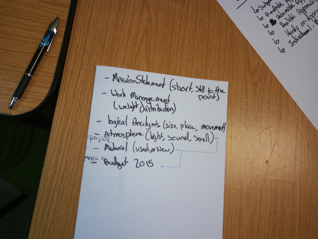
In this lecture we had to brainstorm and come up with things that play an important part in the creation of the exhibition like the budget, theme and so on. We worked in a team of 5, Me, Marlon, Noel, Joseph and Phillipa. The lecturer gave us some points in order to assist us and we started to combine each point and to connect all the ideas and bridge them. |